Logos are the very heart and soul of a brand, so it’s not surprising that an institution goes to great trouble and expense when redesigning their representational mark that acts as the core of their brand. A rebrand occurs for all sorts of reasons—to differentiate from competition, redefine a personal relationship with an audience, create credibility, or sculpt order from chaos. When an institution chooses to redesign a logo, who decides the direction a new visual identity should take? I argue it should be a trained designer or creative director, but the ubiquitous use of social media and blogs abruptly changed the way logo redesigns are discussed, allowing just about anybody to state their opinion and bring a new logo into fame or infamy. Social media however, is not the proper forum for discussing works of design, yet it’s impact is far-reaching. Designers need to take back the task of critiquing their own work, rather than letting the task fall to blogs and social media. Experience and understanding of the process make designers more equipped to judge a logo as a solution to a problem. A logo is a quest for timelessness (Pentagram 3), but the present technologies demand rebranding efforts to be subjected to the timely opinions and trends pressed upon them by the social masses.
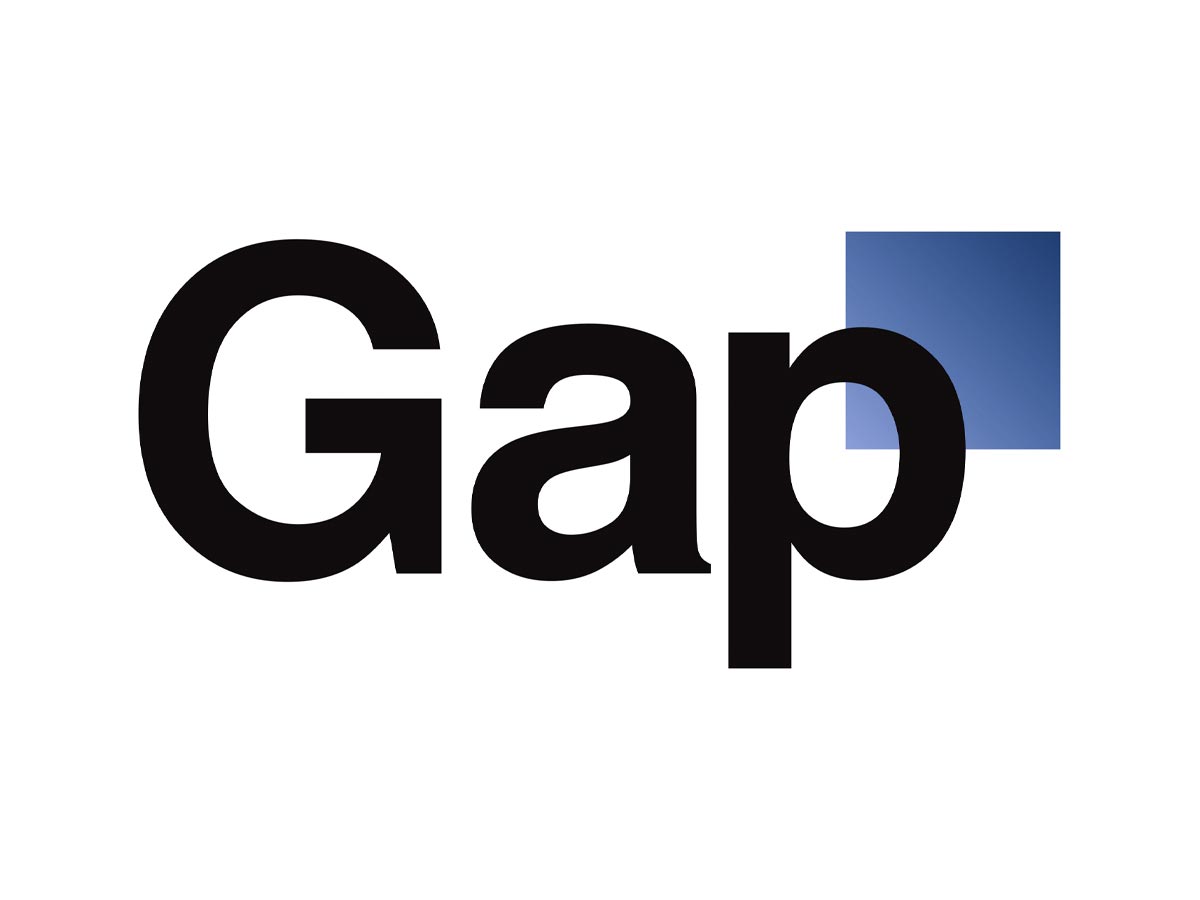
The process of rebranding and updating a logo requires market research, a skilled designer or team of designers, and insight into the subtleties and nuances of how to distill an institution into the simplest form that still defines its unique character. The end result is a source of pride that often speaks on the institution's behalf for years or decades. However, the internet and the ubiquitous use of social media can undo that pride almost instantly and turn a newly redesigned logo into a source of shame. Gap Inc. for instance, faced so much backlash from a soft release of their new logo on facebook that the rebrand only lasted for a single week (Zmuda p6). Gap even went as far as to ask people on facebook to redesign their redesign, stating "We know this logo created a lot of buzz and we're thrilled to see passionate debates unfolding! So much so we're asking you to share your designs" (Ellis p7). This created an even bigger disaster for Gap, where design studios revolted at the idea of a crowdsource fix.


The vast viewpoints of social media quickly turned a hopeful rebranding into a quick undoing and proves that social media and blogs are not the best platform for design criticism. Opinions on social media are shared with too much emphasis on basic visceral reactions of simple likes or dislikes, with little insight into possible solutions. This type of criticism is not constructive by nature and does not aid in the bettering of the design.
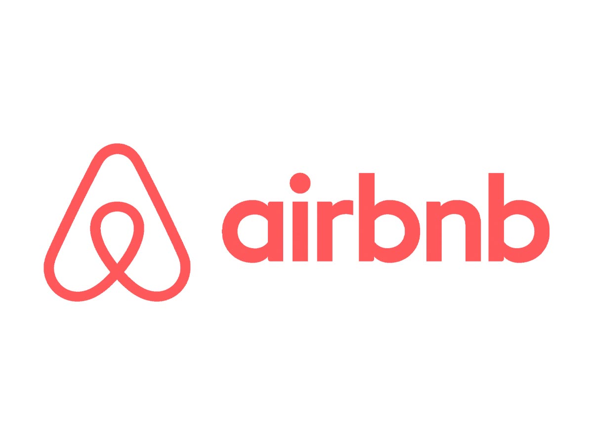
Numerous blog posts are generated each year on the worst and best logo redesigns, many of which share the same examples. However, a more careful examination of the posts shows the same logo on the both the best and worst side of the list. This is the case for airbnb when it released a rebrand in 2015. It was praised for its minimalistic style (Aouf p5), while being bashed for resembling “a pair of you-know-whats” (Gendelman p15). Having the same logo fall under such dramatic variability in opinion only leads to confusion about what is a good redesign and what is not.


So despite the desire of institutions releasing their redesigned logos on social media and subjecting them to list bait blogs, the formal process for reviewing logos should not change. Skilled designers and teams that work on rebranding should focus on what is important—finding that timeless icon to represent their company or themselves. It is an exercise in discipline and insightful reasoning. Designers should not let a bunch of loud-typing internet consumers dissuade a well-crafted redesign. After all, a good redesign is based on research and need, not vanity and trendiness. So why let platforms such as social media and blogs decide which rebrands are worth the time and dedication?