Biological Typeface
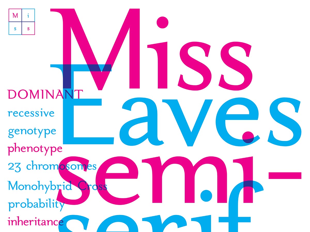
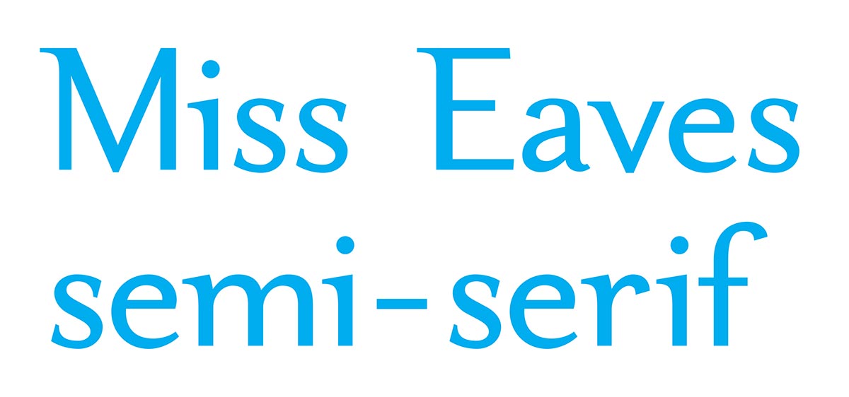
Miss Eaves is a semi-serif cross between Mrs Eaves and Mr Eaves by Zuzana Licko. The typeface combines the two works in a regular weight at 72pt and serves as a concept for expanding the Eaves family of typefaces.
In order to create a new family member for Mrs and Mr Eaves, I needed to figure out what properties of each typeface I would combine to create something new. Recalling some old biology coursework, I settled on the concept of crossing the traits of the two typefaces using a Punnett square.
A Punnett square is a simple diagramming tool used in genetics to predict the probability of all possible outcomes between mixing traits from parents during a simple breeding experiment. However, when using a basic two by two Punnett square as a model, there are as many as 3 different outcomes. One of the outcomes is an exact replica of the parents, and the other two are hybridizations. This led me to the idea that one hybridization of serif and sans serif would be semi-serif, and the other would be semi-sans. The semi-serif, which is the focus of this project and what would make an overall more unique typeface, is the daughter of Mrs and Mr Eaves, simply referred to as Miss Eaves.
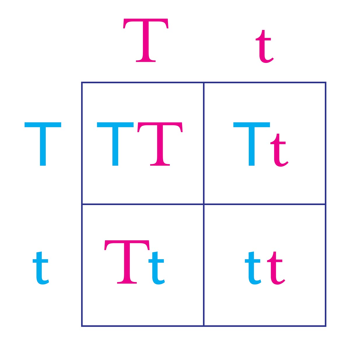
To translate genetic inheritance into typography, I decided the main strokes and initial serifs would be considered dominant traits, while terminal ends and cross bars would classify as recessive. Also, the counters of letters would be dominant for the other parent, so letters like o would have the outer shape defined by the serif version and the counter defined by the sans. The dominant traits mask the recessive traits and are more visually incorporated into the offspring.
“Increased knowledge of heredity means increased power of control over the living thing, and as we come to understand more and more the architecture of the plant or animal we realize what can and what cannot be done towards modification or improvement. Heredity is the link that binds us all together.”
—Reginald C. Punnett
This way, the new typeface would lean more toward the serif styling of Mrs Eaves but allow for more changes to the contrast of strokes and show features of Mr Eaves as well. The nice part about merging these two typefaces together is their fairly consistent proportions, cap height, and x-height. For many letters, the differences are a matter of averaging secondary stroke thickness and adjusting the distance curves, vertices, and descenders drop below the baseline. For more complex letters like the lowercase m and g, a more thoughtful redraw became necessary.
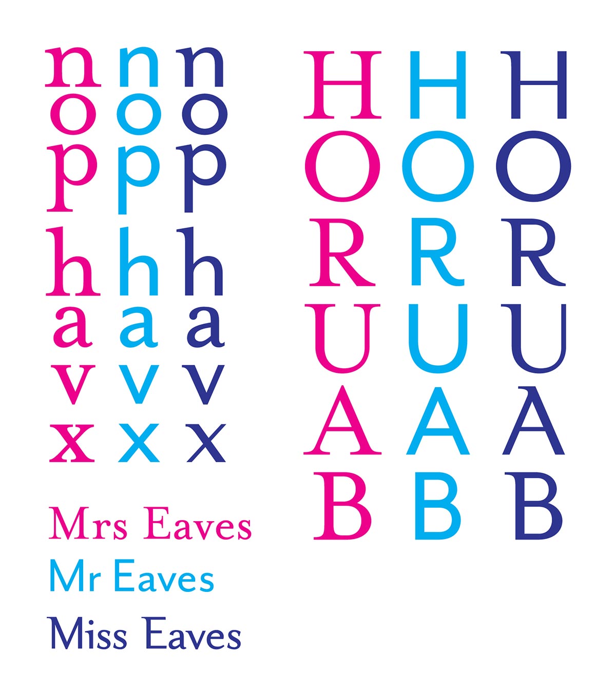
The main process for hybridizing two letters would be to give them opposing colors, line them up on the baseline, then get the right or left side of the main strokes aligned to produce an overlay effect. Interestingly, this process reveals some subtle differences between letters that would seemingly not require much differences. For example, the tittle on the lowercase i and j are slightly larger and sits just a bit higher above the main stroke in Mr Eaves.

To remedy this for my version, I averaged the differences and left them leaning a bit more toward the original size of Mrs Eaves to keep it on the female side of the proportions. The most dramatic change comes from the removal of all the ball terminals. Instead, I replaced them with a flat terminal cut at an angle based on the serif of the ascenders from Mrs Eaves. This new terminal on letters like a, r, and f really give Miss Eaves her own style that creates new value in having an additional member of the Eaves family of typefaces.
Full Alphabet and Glyphs
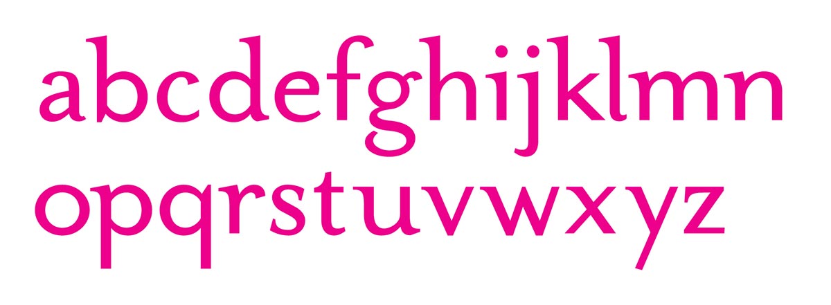
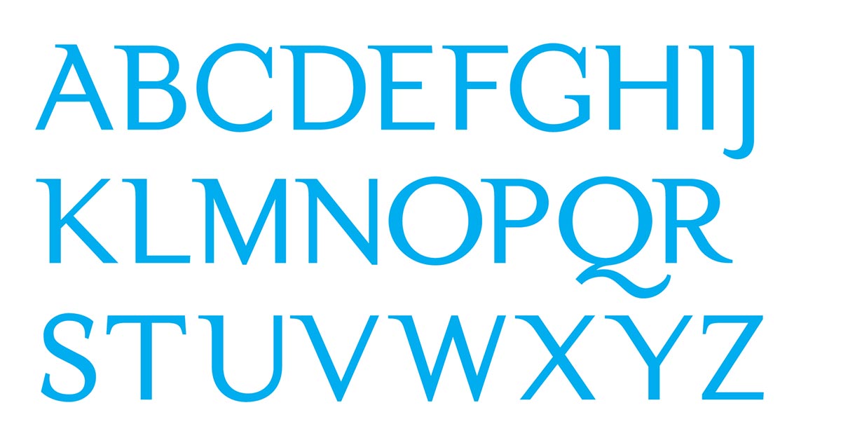
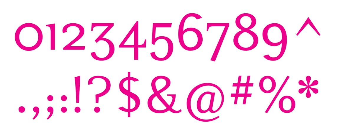
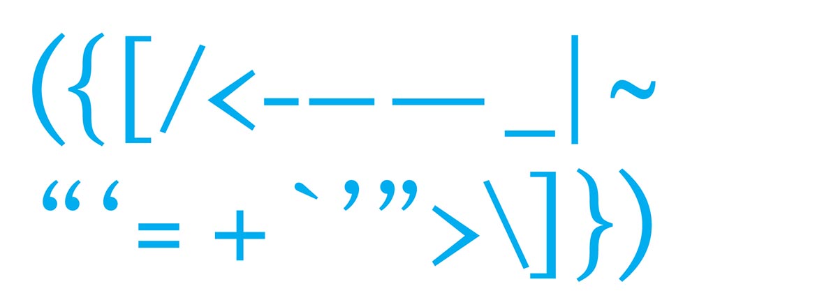
Miss Eaves, being a concept, has only been designed at regular weight, but features the full glyph palette on a standard computer keyboard.
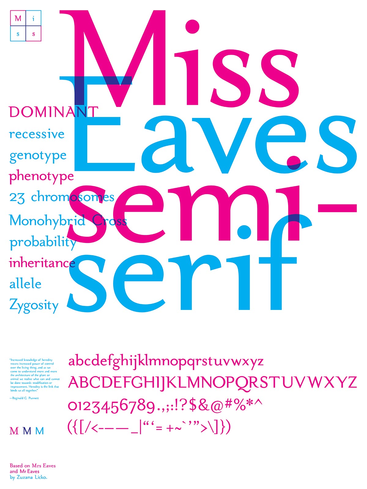
Type Specimen Poster
The poster for Miss Eaves references the hybridization process where parts of the two parent typefaces overlap to form a new family member. The poster features words associated with genetic crosses and biology as well as a quote from the creator of the Punnett square.
