Defining the Challenge
The purpose of this design research project is to redesign the system in which beginning typography students learn the anatomy of typography and test them over the material. To create and test a new idea, a sprint method is used and tested with real design students.
Some basic questions asked during the sprint include:
How can we be sure students are learning? What type of content engages students? Will students of all levels be able to use the method to learn? What practical knowledge does learning about typeface characteristics provide design students? How much time needs to be dedicated to teaching Type ID? What are the most important pieces of terminology for students to learn? Will students use and enjoy the tool for learning about type anatomy?
Asking the Experts
Q. Why do the students need to identify specific typefaces?
A. Identifying typefaces builds skills in visual perception and helps them learn a vocabulary for the design industry.
Q. Why do we have students describe the individual pieces of type anatomy?
A. The type anatomy speeds up the process of talking about type and acts as a shortcut when talking with other designers.
Q. Do you find it beneficial for students to be able to recognize typefaces from memory?
A. Not particularly. Students need to recognize the uses and differences between typefaces, but they often learn to recognize more common typefaces.
Q. How do you recommend students practice identifying typefaces?
A. They can use resources like the ComDes catalog or websites like fontsinuse to see type in actual projects.
How Might We
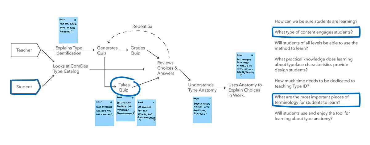
How Might Wes are a brainstorming activity for generating potential features for a prototype and aim to solve potential problems users might face. HMWs are generated, sorted, and prioritized for their inclusion in the prototype.
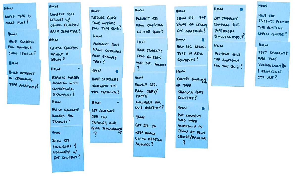
User Flow Map and Target
Next, a user flow map is created that covers the path all parties involved in the design will take when using the prototype. The priority HMWs are placed on the map to help identify a target for the sprint prototype.
Observations
Students were observed taking a quiz in its current format.
8 out of 9 students have quiz open full screen and switch back and forth between the catalog until they answer the question. Students copy and paste the text from the catalog into the quiz answer area on their answer box. The answer area is a simple textarea element and does not allow them to draw anything. The online quiz system has caused 2 students to lose their work due to a form submit error. Most students assume they will make a perfect score, and only a few didn’t. Most scores were 5/5 or 4/5.
90.5% of students claim to have learned something by taking the quiz. 56.5% of students are fine with paper or digital quizzes, while 39.1% prefer digital. 30.4% of students said they only sort of understood the directions for the quiz.
“Taking the quiz on assignments is a little complicated, it would have been easier to create a quiz on the assessment tab.”
“I went to the catalog and wrote down what they identified on the page the font was labeled. I wasn’t sure what kind of things we needed to describe so mine were very basic and random.”
“The quiz would be easier to take if there were spaces for the answers on the pdf.”
“It wasn’t that difficult because we got to use the type catalog but if we didn’t have it, I feel like everyone would’ve scored low because we haven’t learned much about type other than the start of this class.”
Sketching
Once a target is established, which became students taking the quiz, sketches and a storyboard are made to initiate the prototype phase.
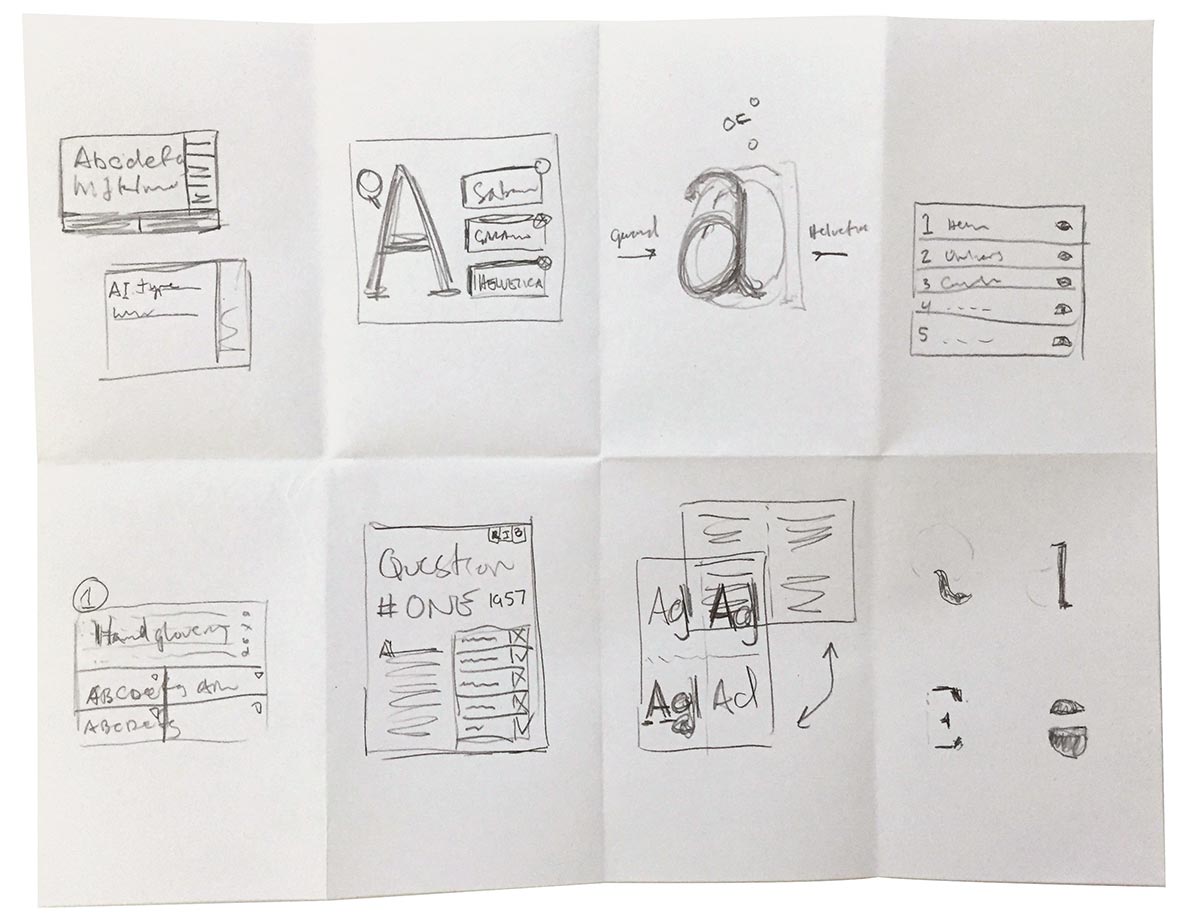
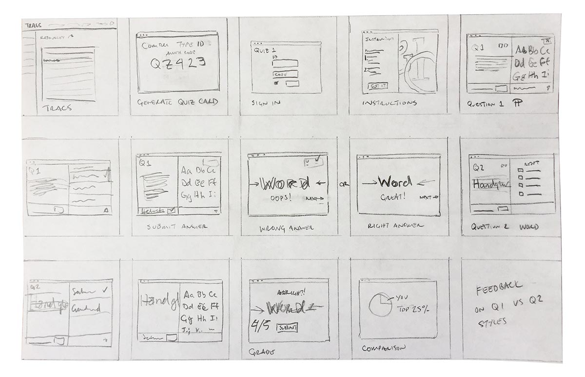
A solution sketch is created to work out how some features will be integrated into the prototype.

User Testing and Prototype
Students familar with the original testing process will test the new quiz prototype. Students will be walked through the quiz up to the instructions screen and then told they will only have to work the first two questions.
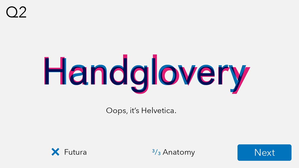
In order to focus the test on navigation, and not the information in the quiz itself, students will be given an aswer to choose for each question.
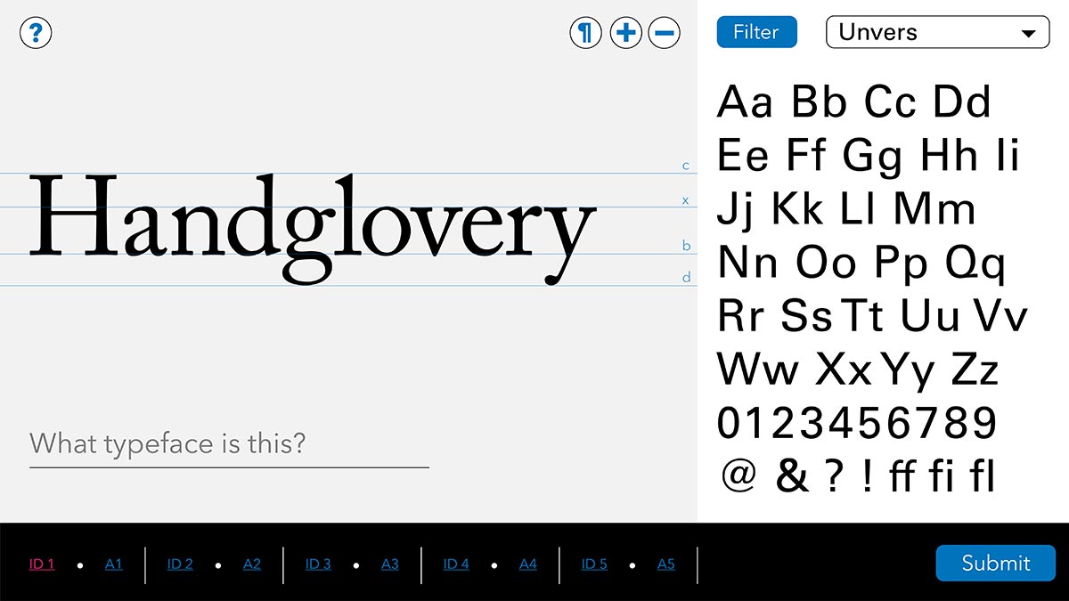
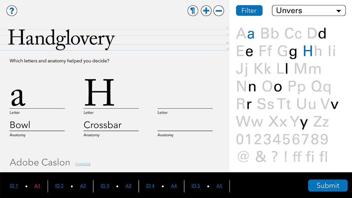
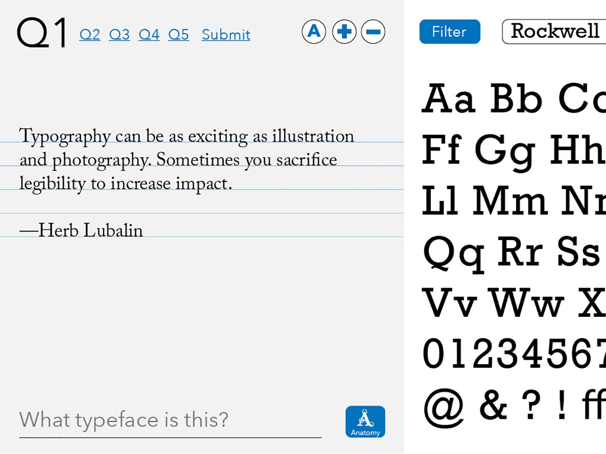
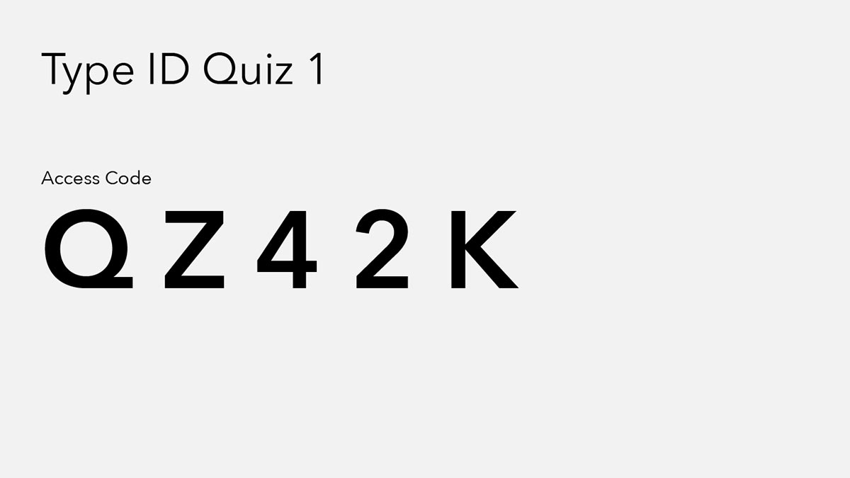
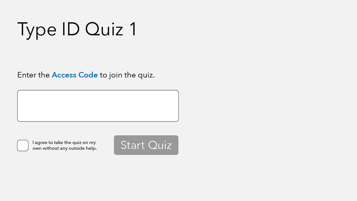
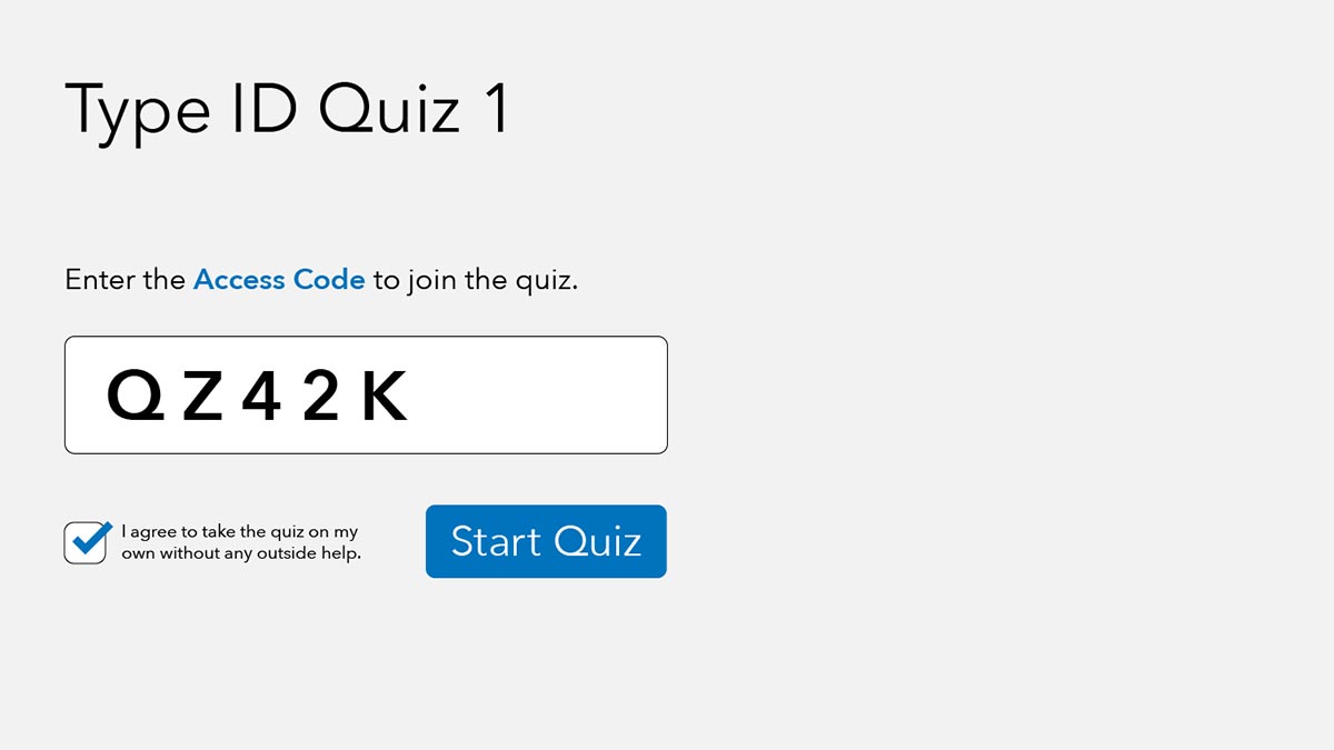
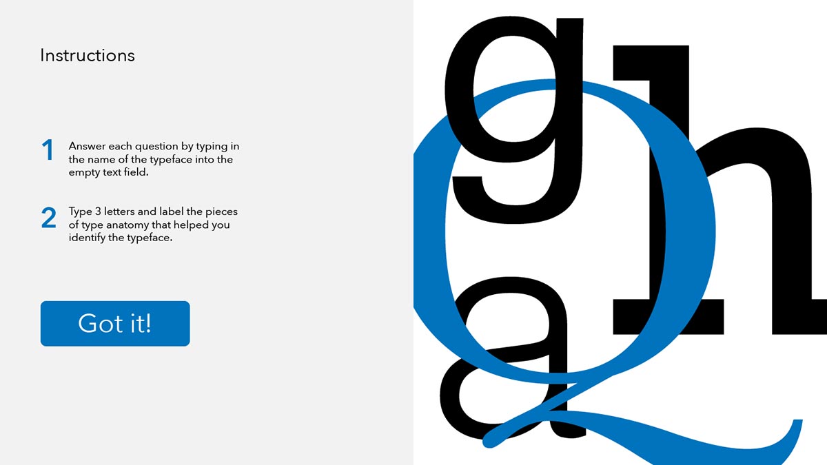
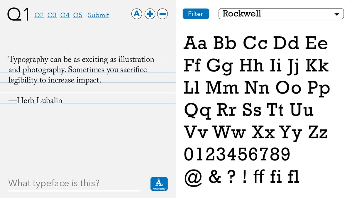
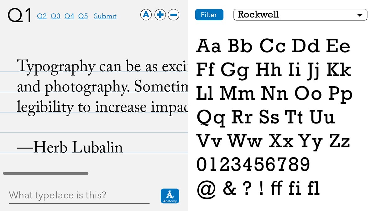
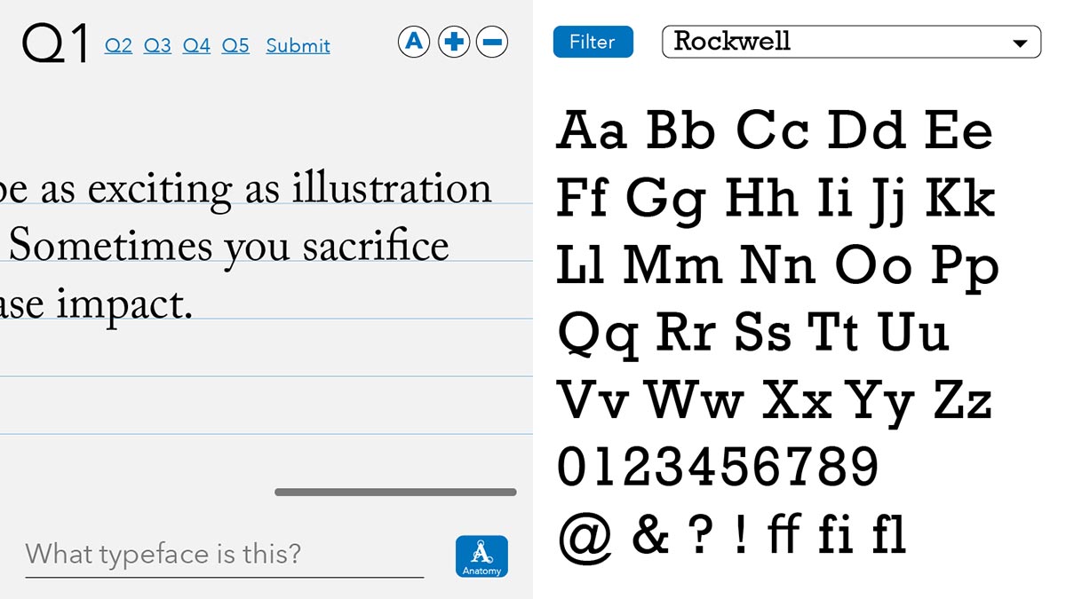
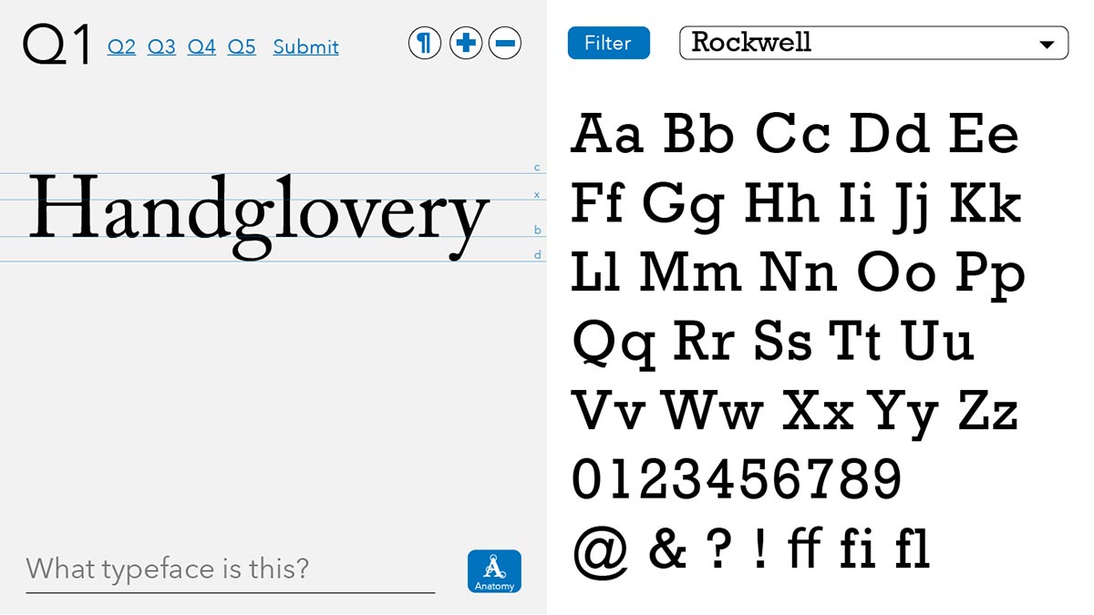
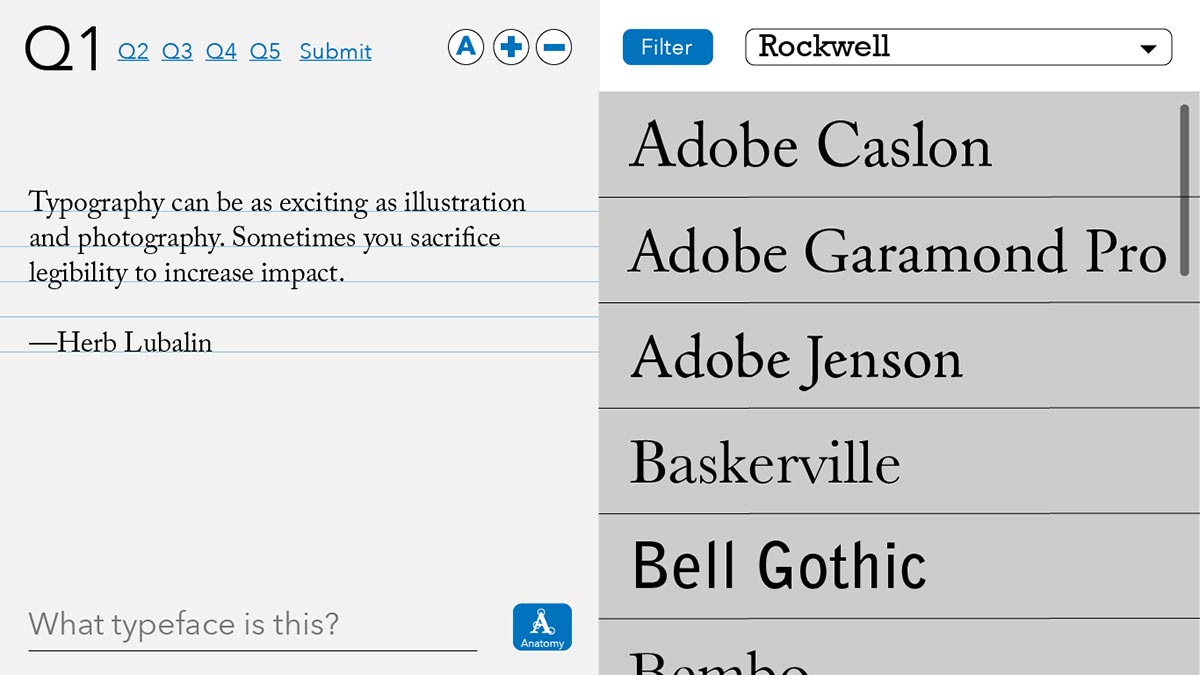
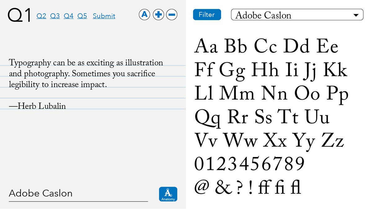
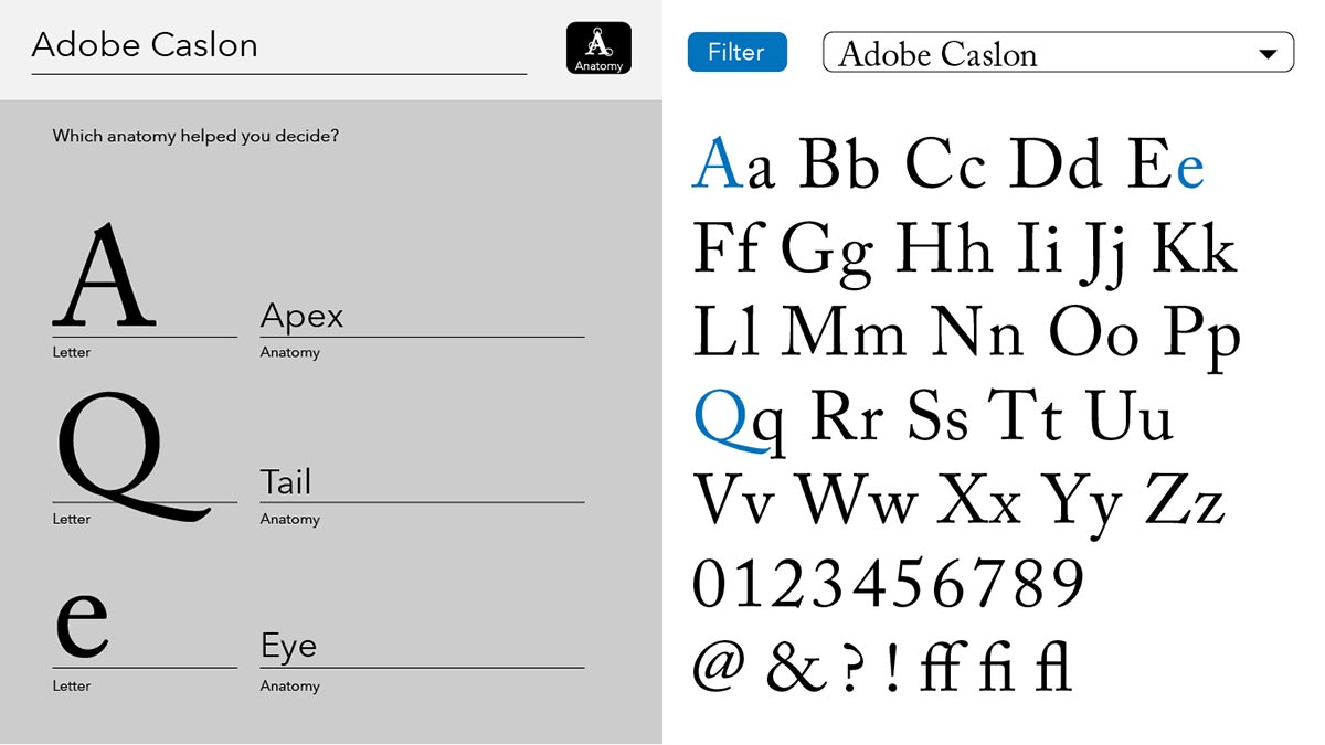
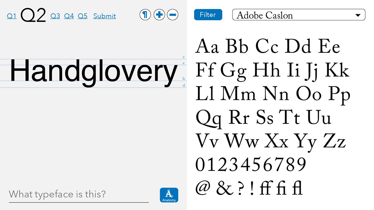
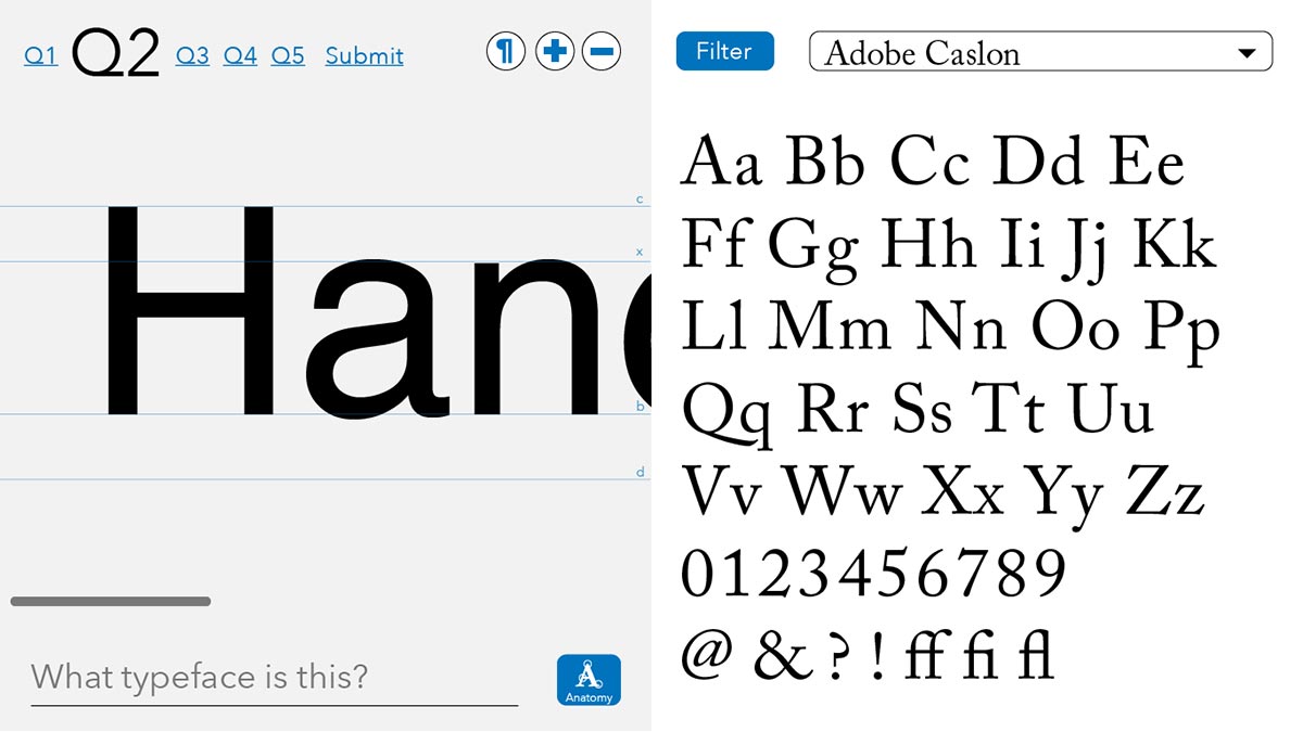
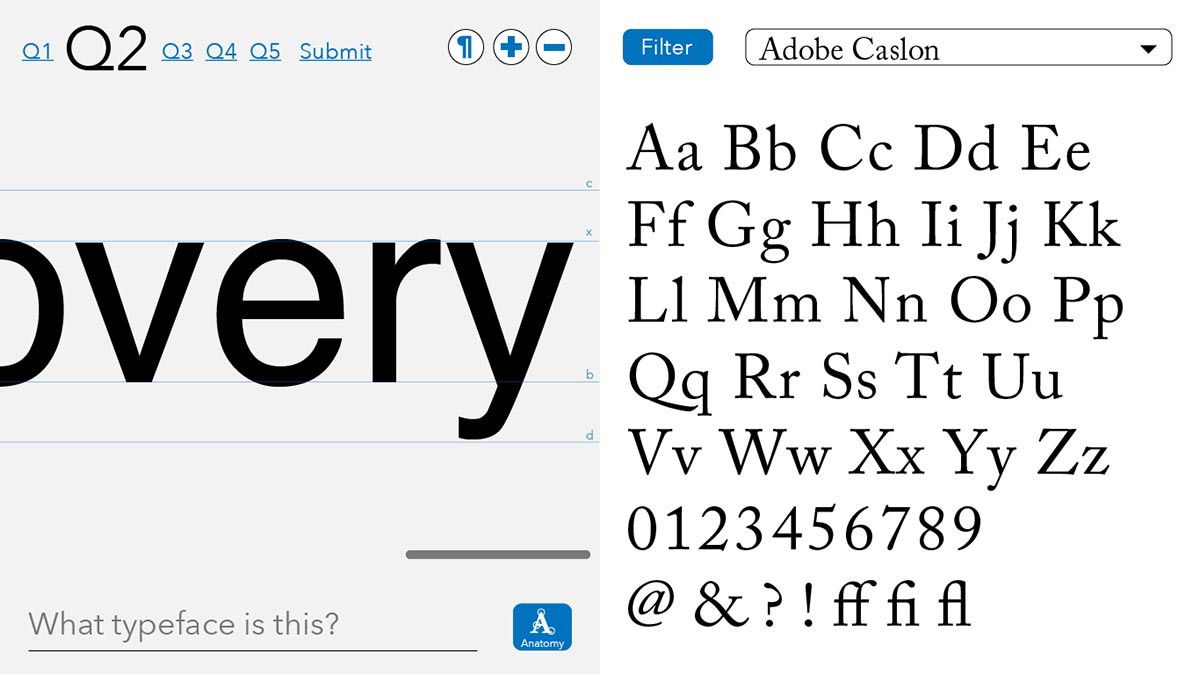
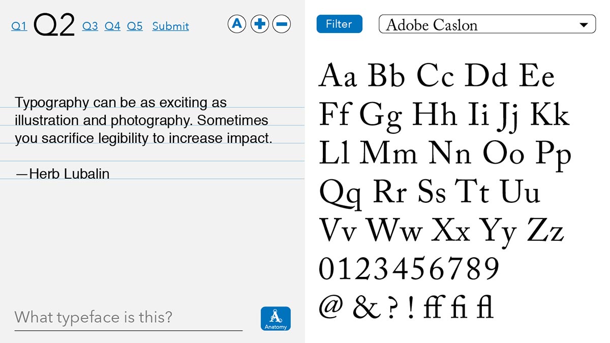
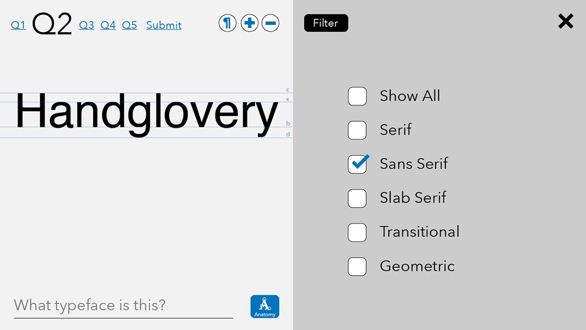
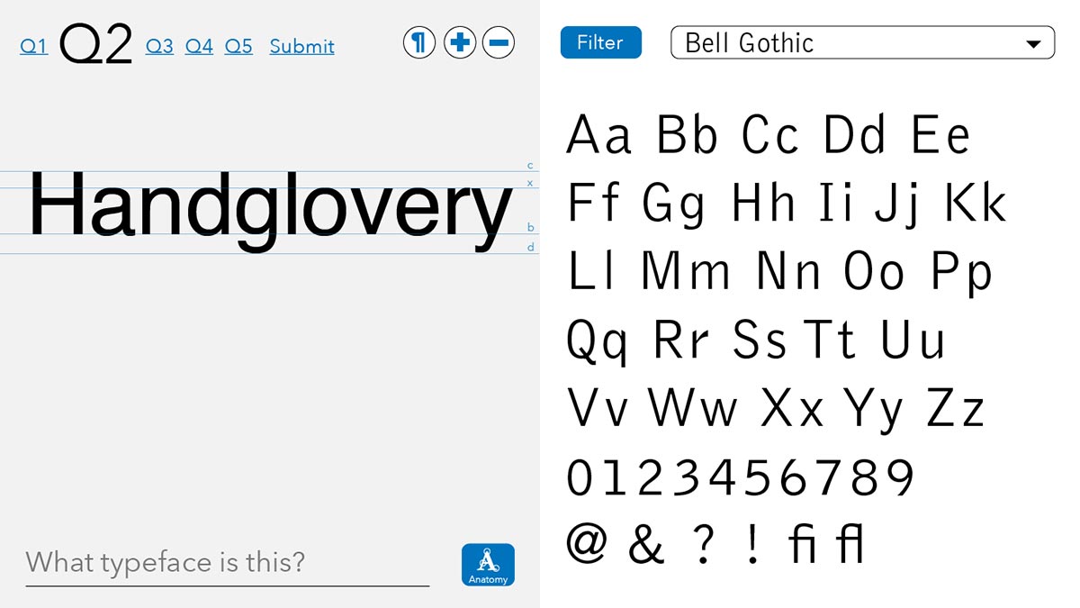
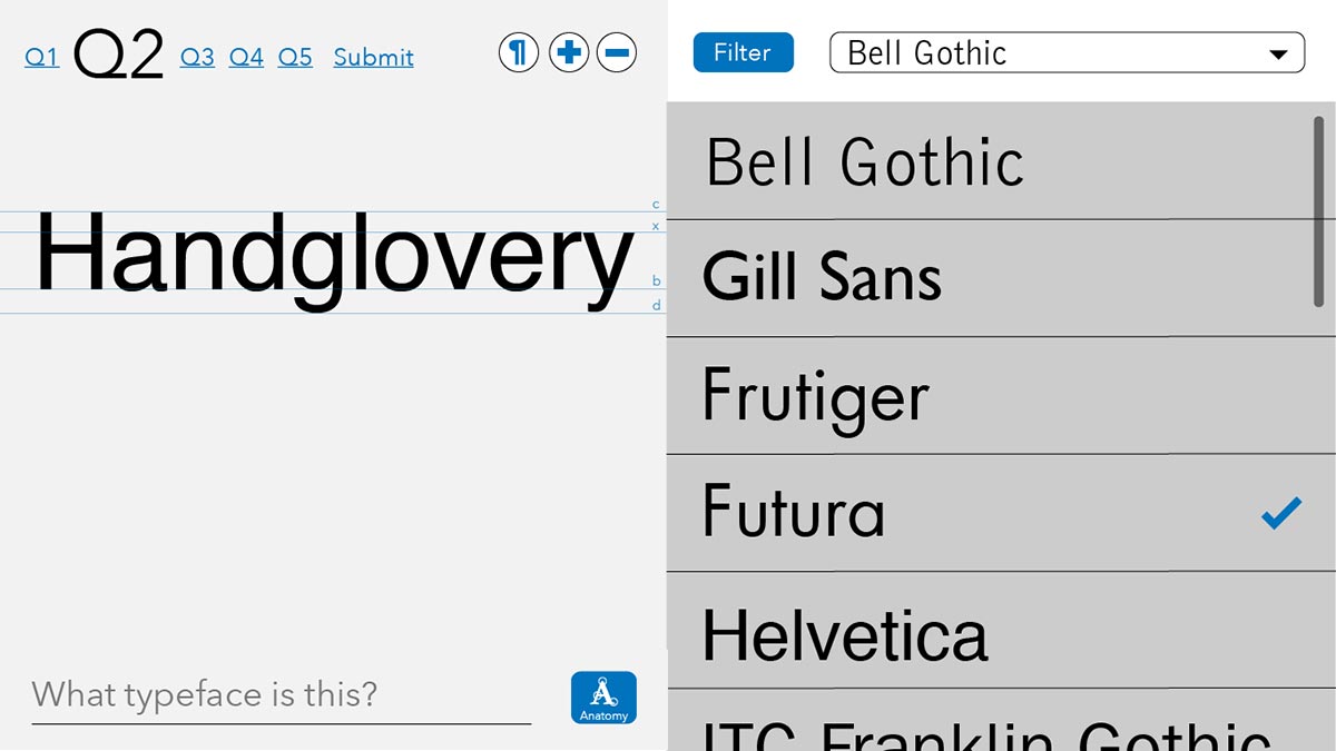
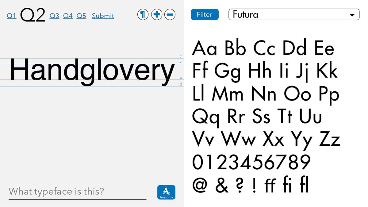
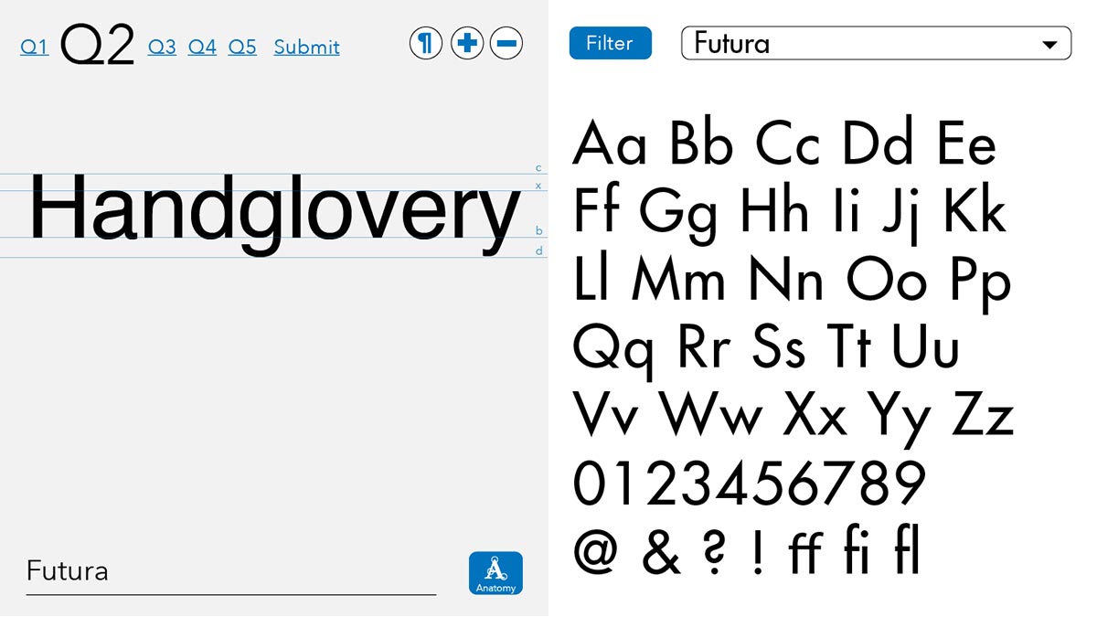
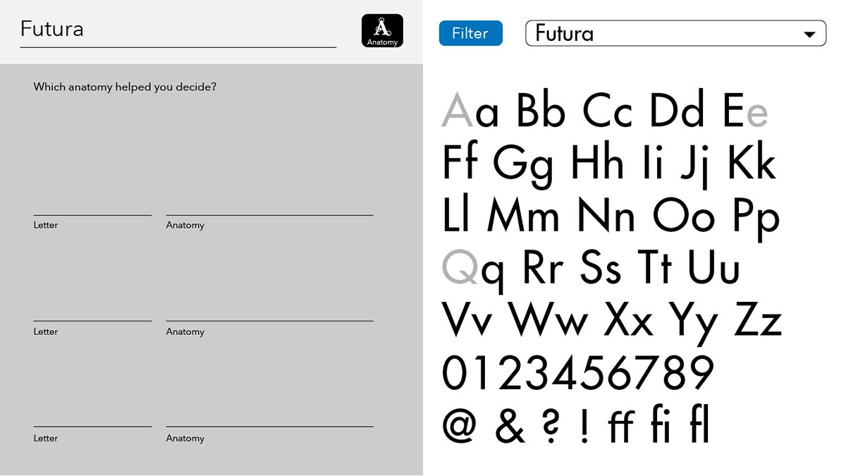
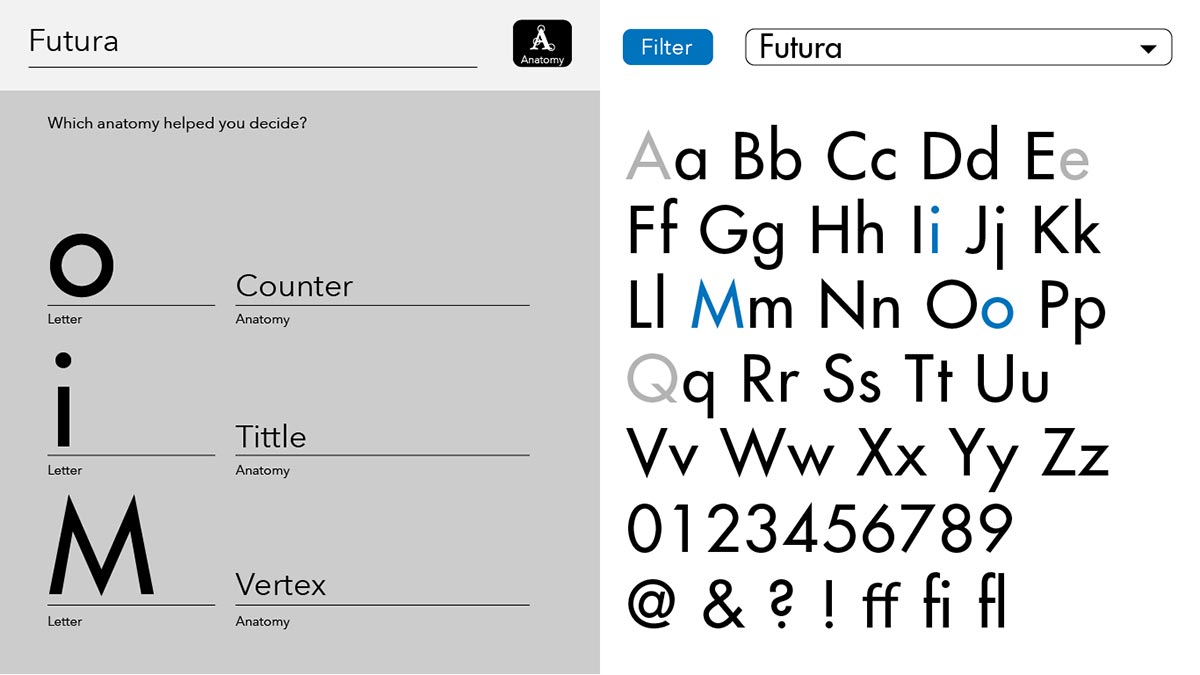
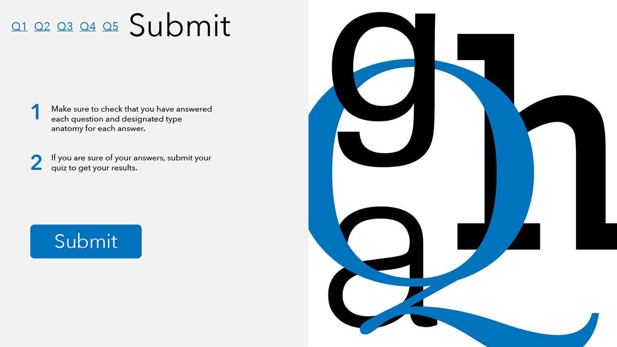
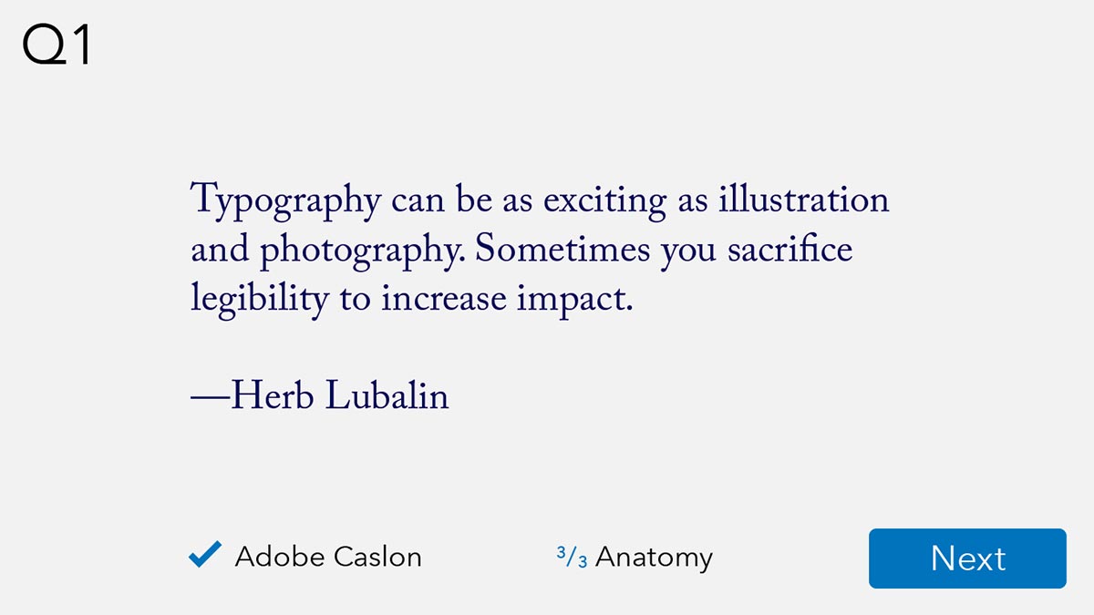
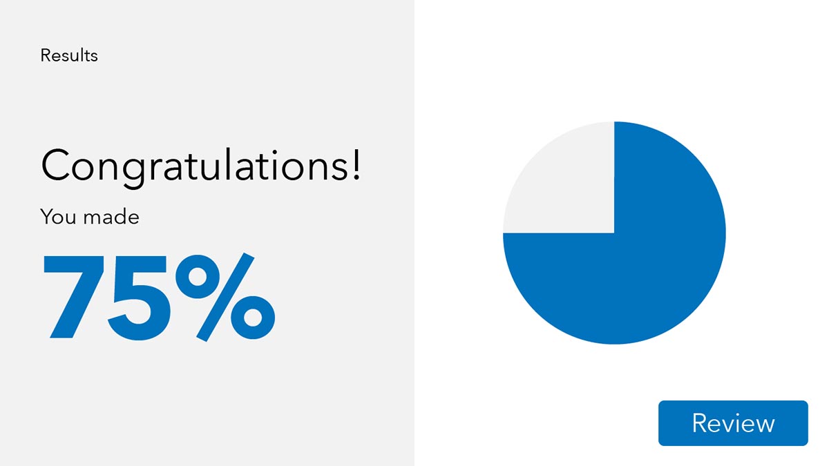
The following screens are from the interactive prototype.

Survey Results
After students interacted with the prototype, each answered questions about their experience.
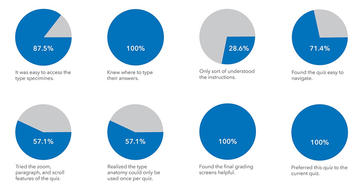
The results from the questionnaire and following interview show that the quiz format is much eaiser to navigate with the quiz and catalog as one unit, but some aspects like the type anatomy are unclear.
Part of the issue with the navigation is the size of the prototype, since not all buttons were visible on smaller laptop screens.
Many students liked the layout of the quiz with half the screen for the questions and the other half for the catalog, but others found it hard to tell what steps to take next.
Revised Prototype
After the prototype faired successful in the user tests, the next step meant reworking the prototype into a more polished interface that addresses any concerns.
