Website Redesign
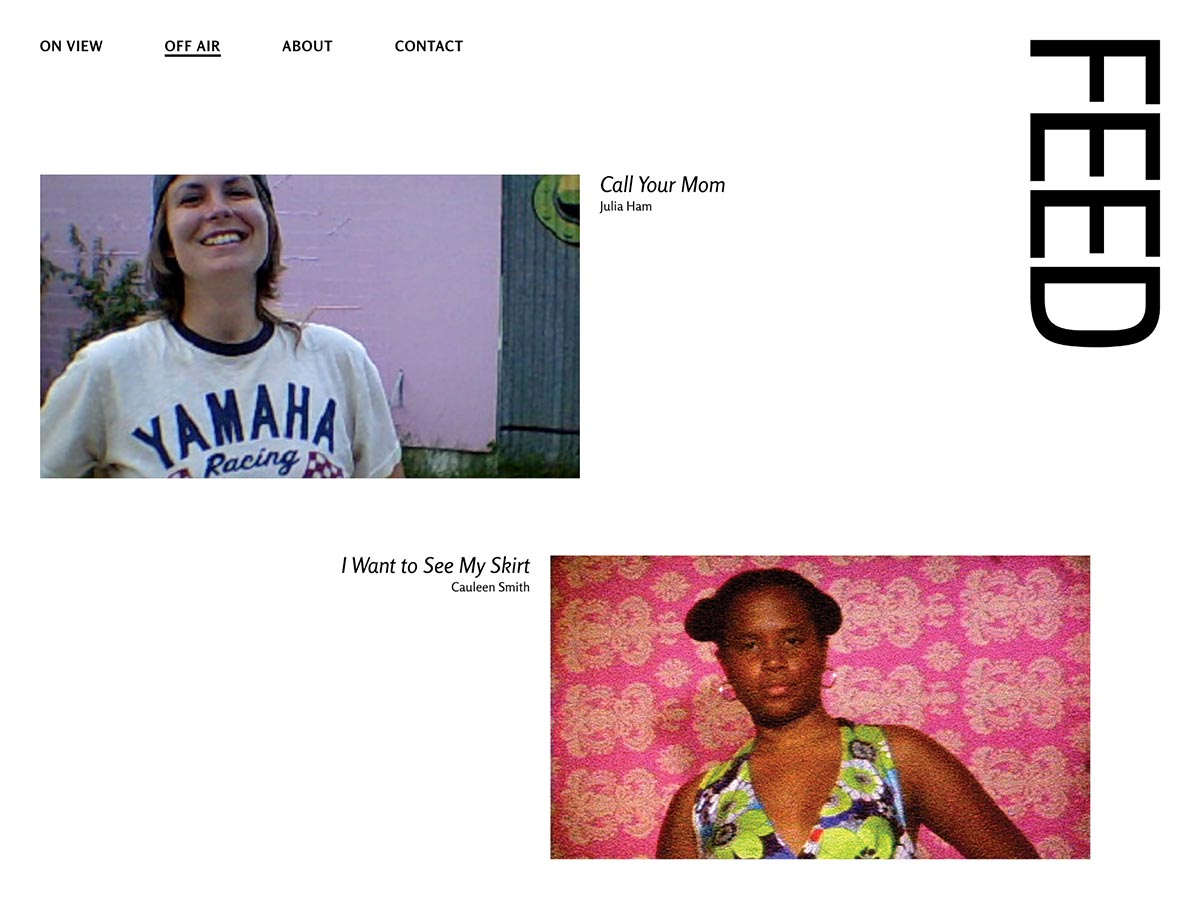
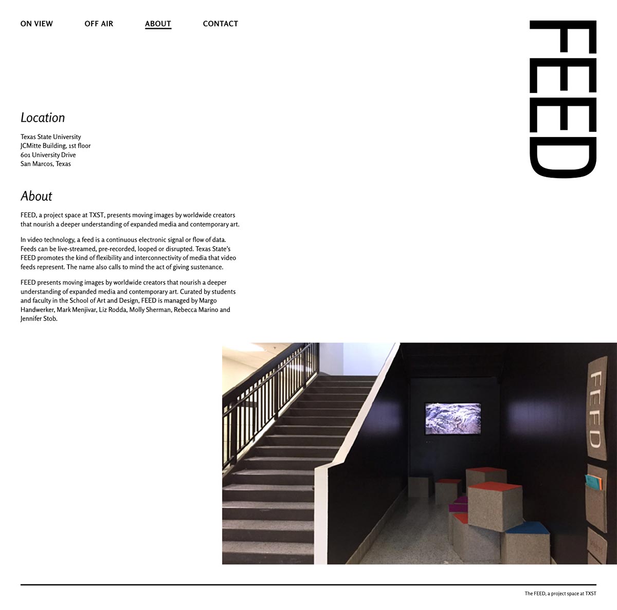
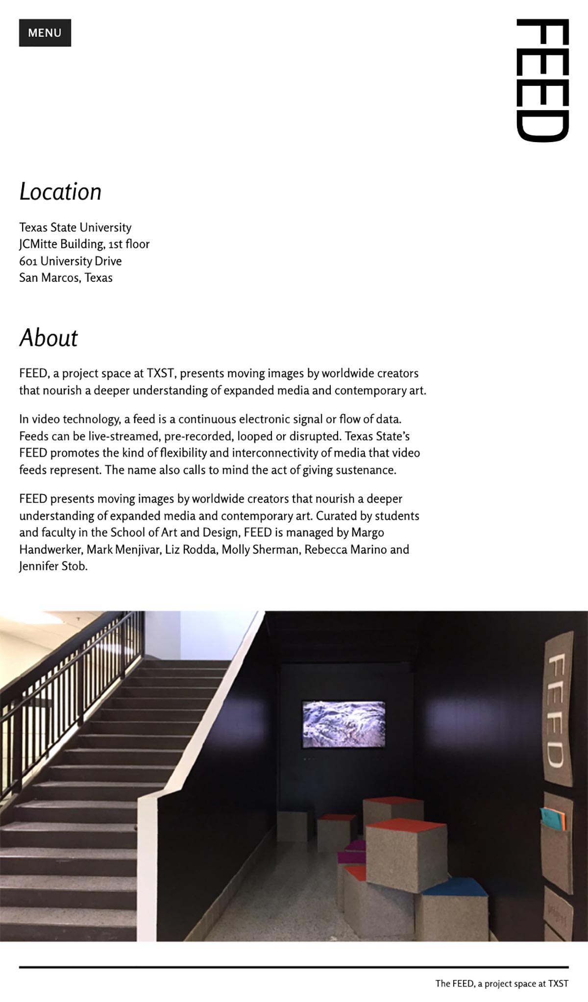
The FEED project space is a small area in the Texas State JCM building that showcases video works from artists and students. The space is nested under the main stairwell and houses a video screen and seating. The website informs students what is playing and what has played before.
In order to make the existing site more manageable and easier to update, a new Wordpress theme was created to replace the old template. Reworked navigation and a simple site structure allows for a spacious layout across a multiple range of device sizes.
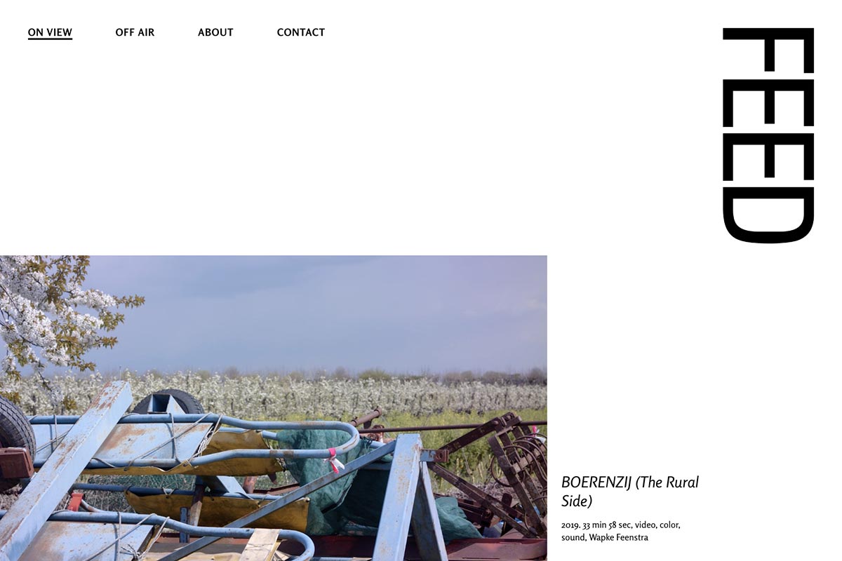
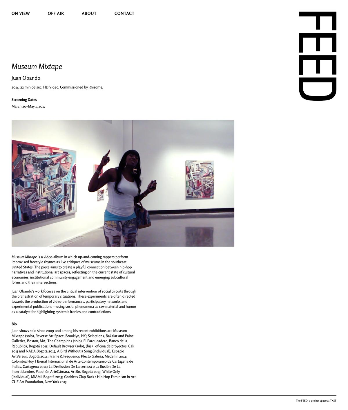
The look of the site allows the current branding of the space to be more prominent, but out of the way enough to let the featured video projects take the spotlight. Clear typography, evident hierarchy, and a minimalist aesthetic pushed the design direction.
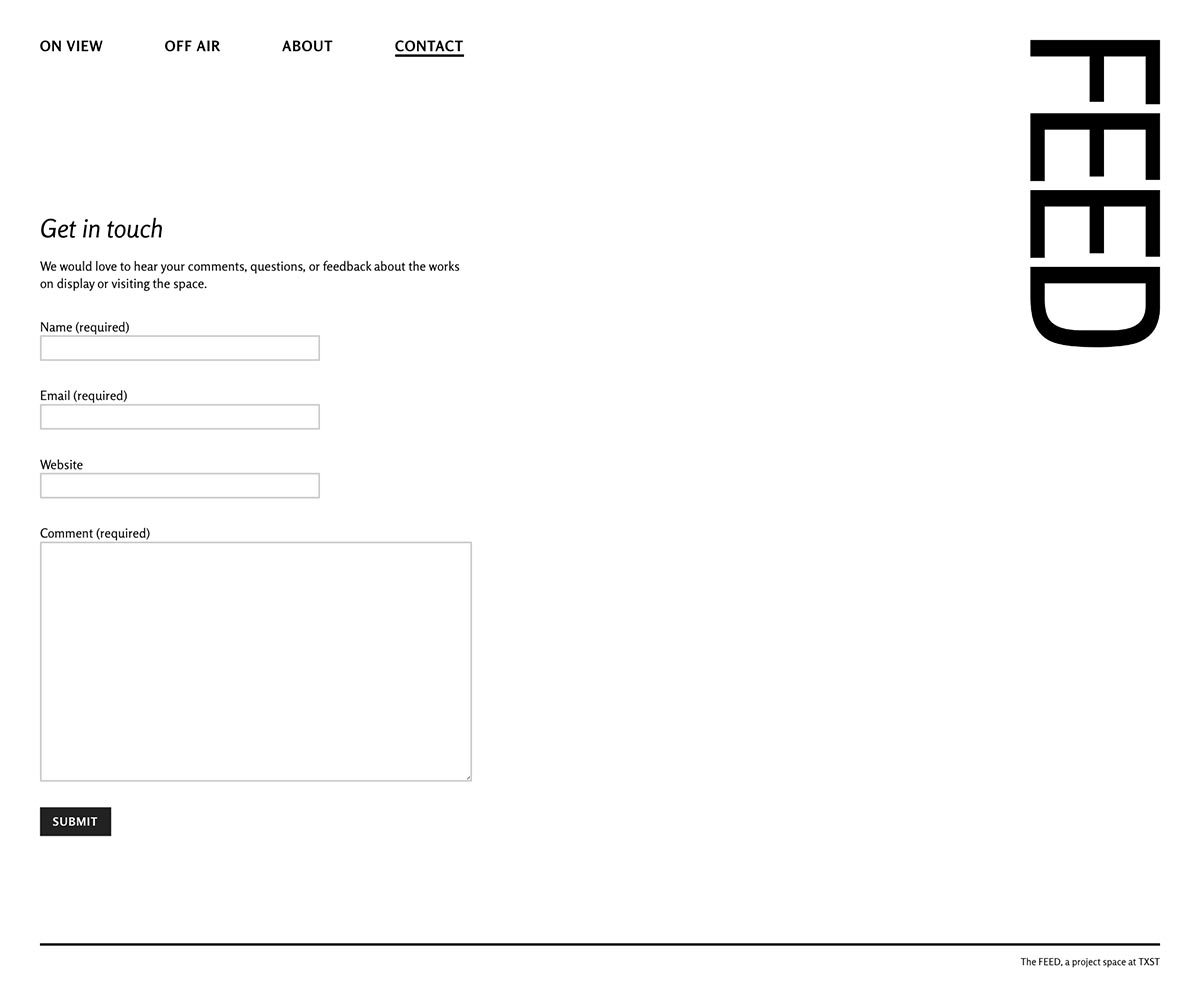
Desktop Scale
The desktop scale uses a top menu navigation and uses the full space of the screen. The site uses an eight-column grid to keep content structured, but has a varied alignment to prevent the site from feeling too static.

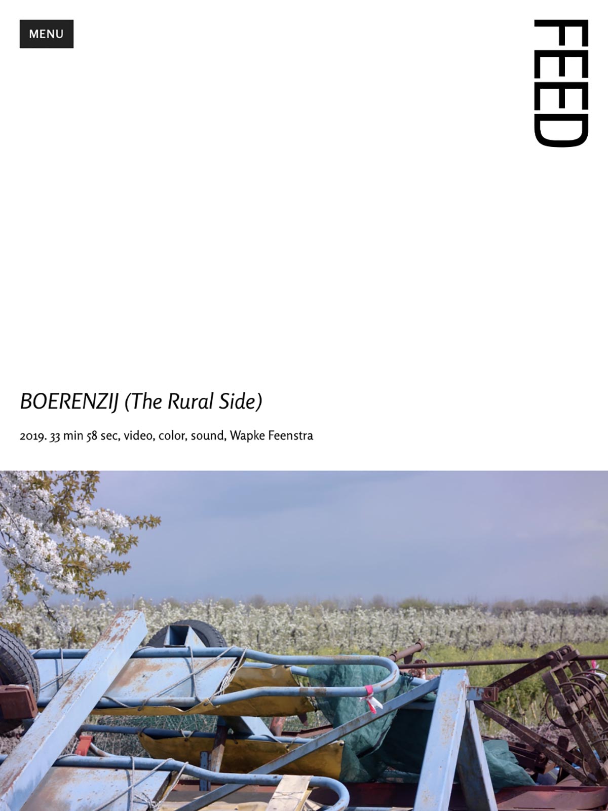
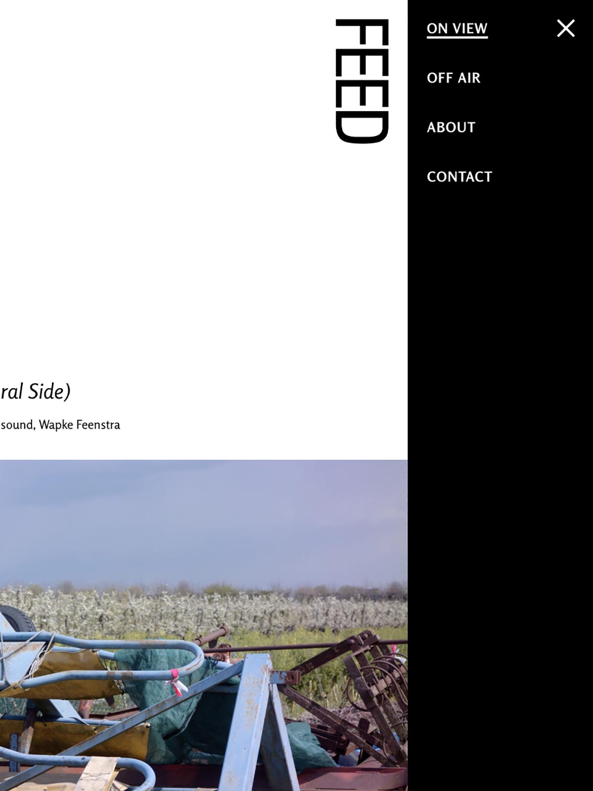
Tablet Scale
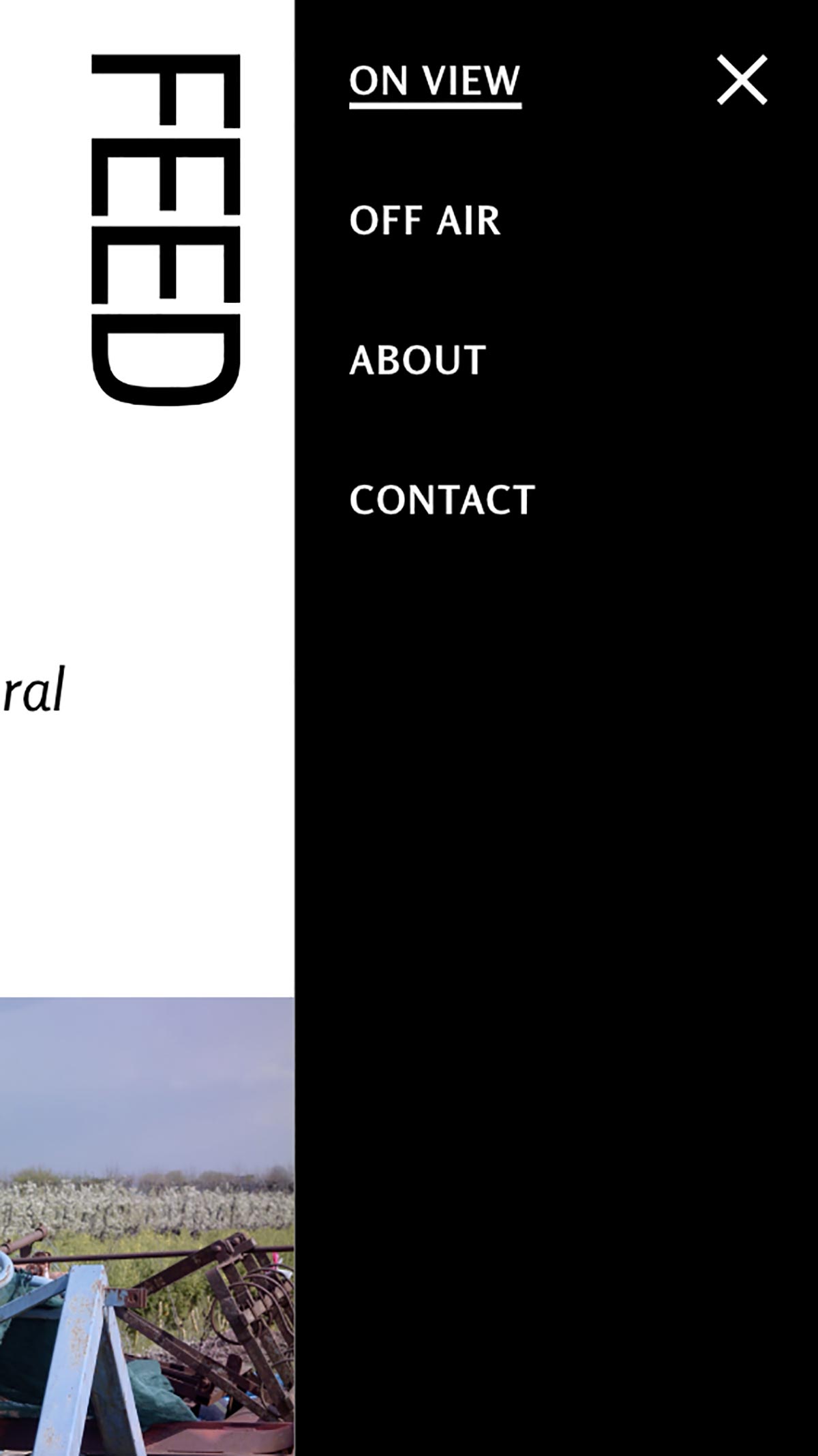
The site removes the top navigation at thinner tablet sizes and replaces it with a simple menu that pushes the site content out of the way. The menu makes it easy to access each page without the text being cramped in a traditional nav.

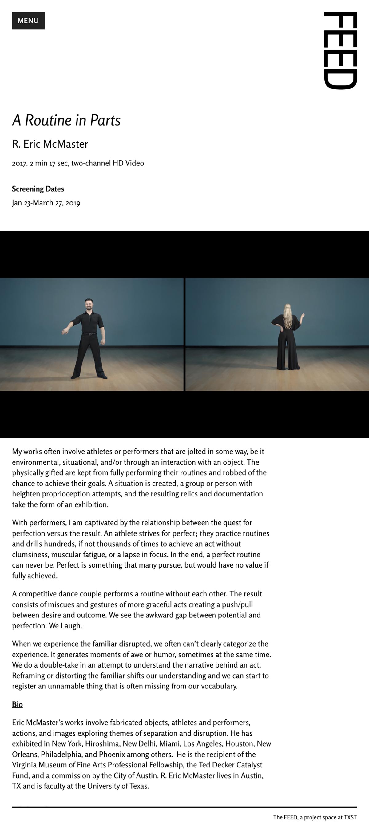
Phone Scale
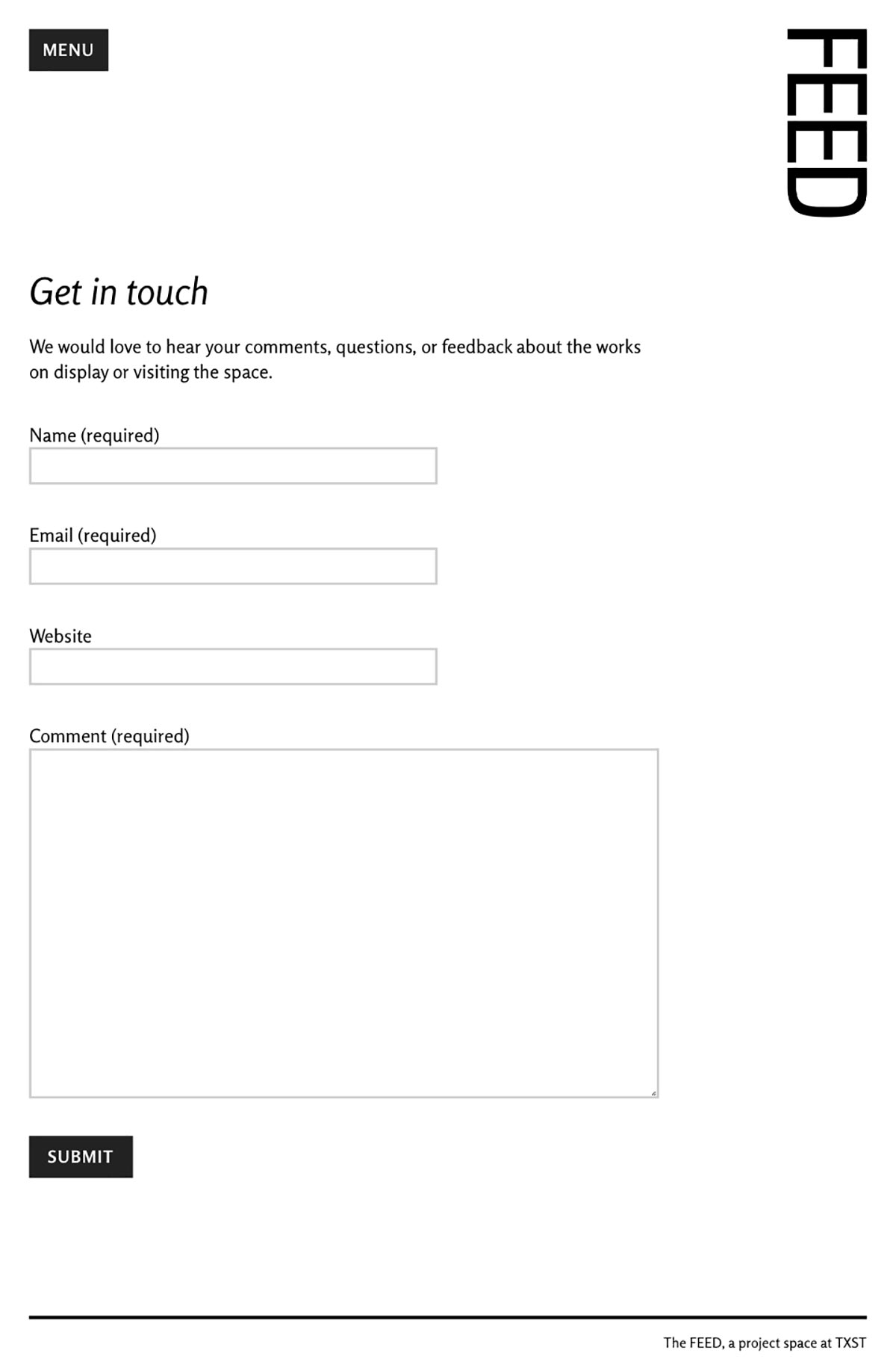
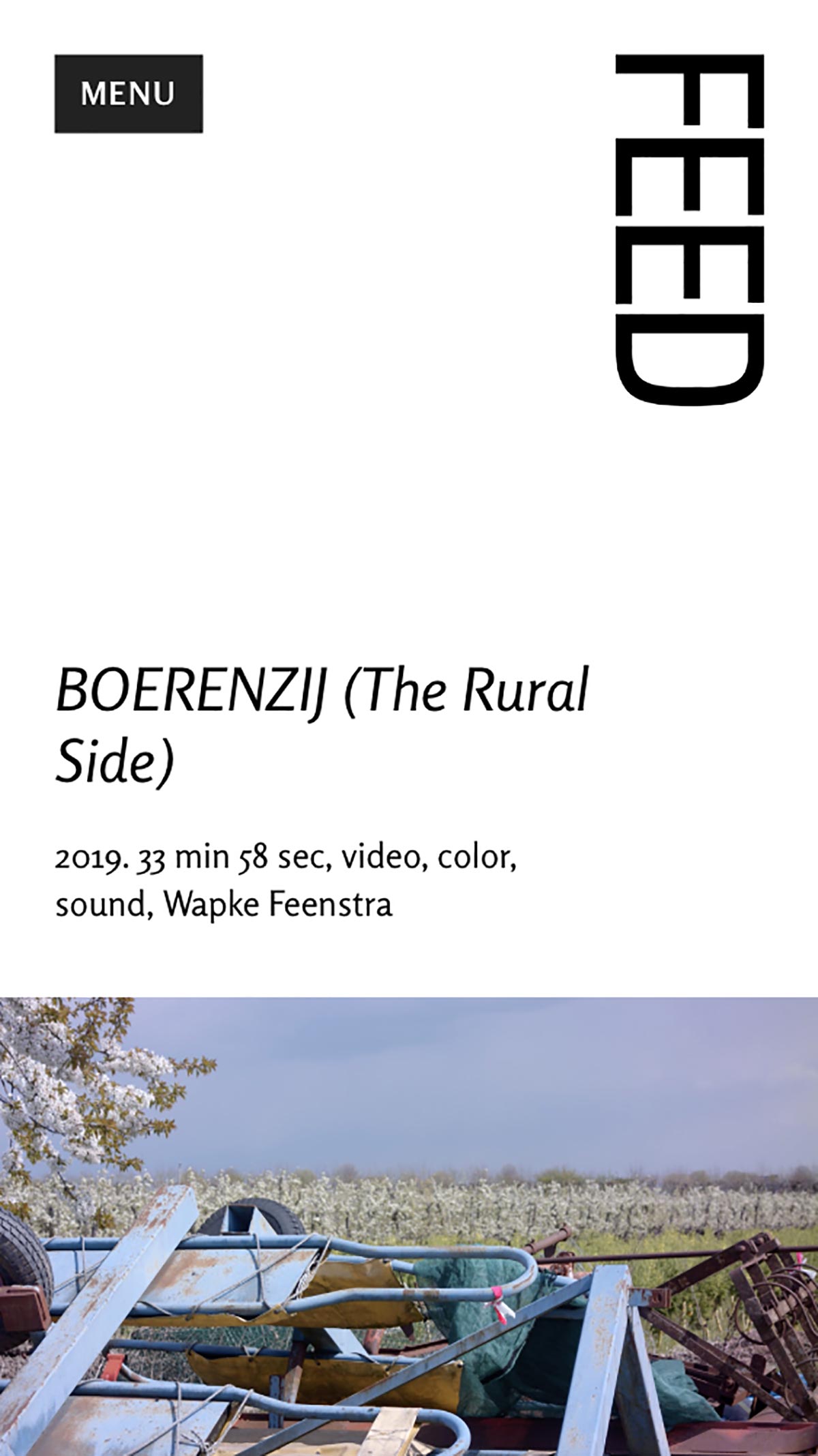
The phone still makes use of the horizontal rhythm of the larger scales, but has more of a back and forth feel. The same menu navigation is used at this scale as a consideration of space.


Visit the site at: feedprojectspace.com
