Digitally Engaged Learning Conference
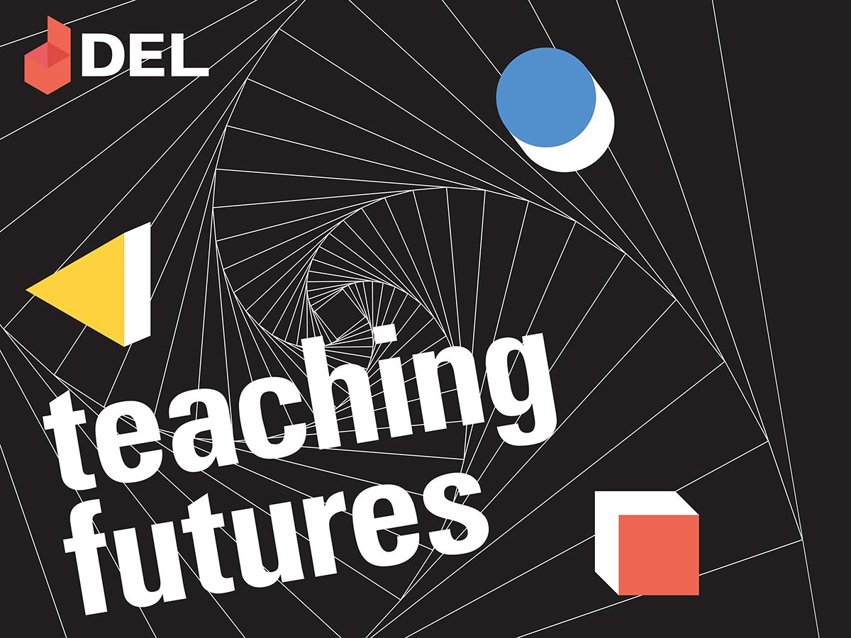
With an open opportunity to create materials for an event hosted locally at Texas State, I found it interesting to work with and modify the pre-existing materials to better represent the specific theme for this year’s DEL conference. This year marks the 100th year anniversary of the Bauhaus, and DEL capitalizes on this time to remind those in design education how much we still owe to a small school from Weimar. To expand on the theme, DEL celebrates this year with a slogan—Teaching Futures, which simultaneously shows how far we’ve come as educators as well as how digital learning will propel the learning environment into the future.
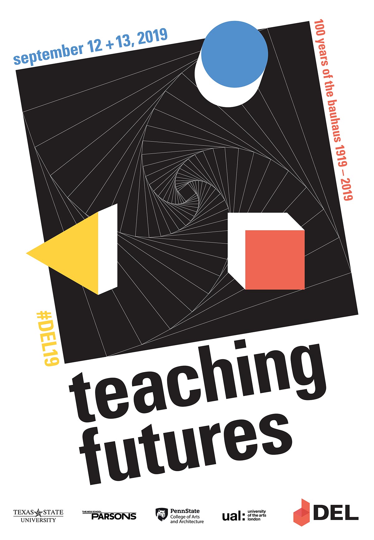
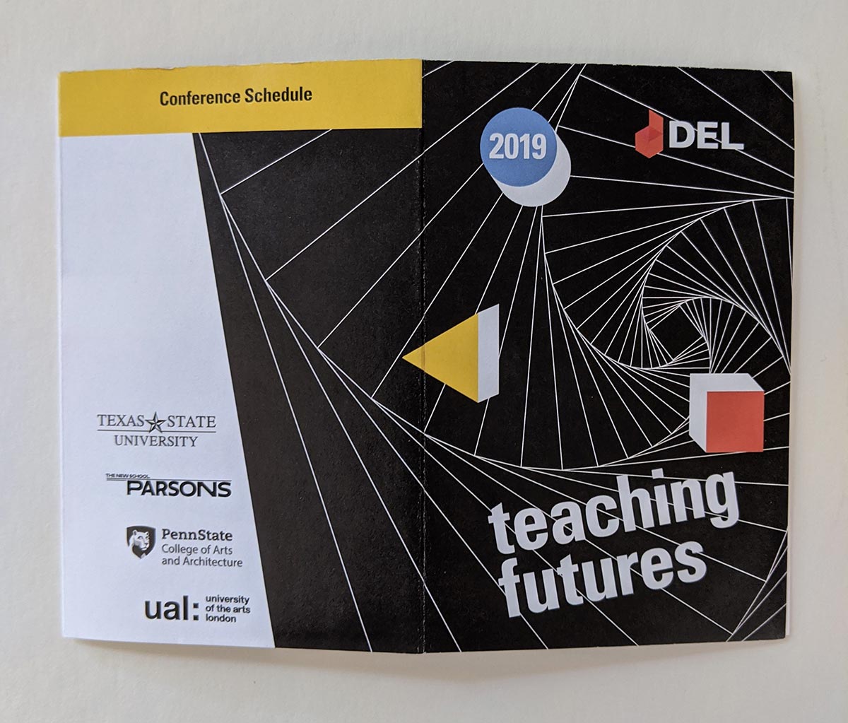
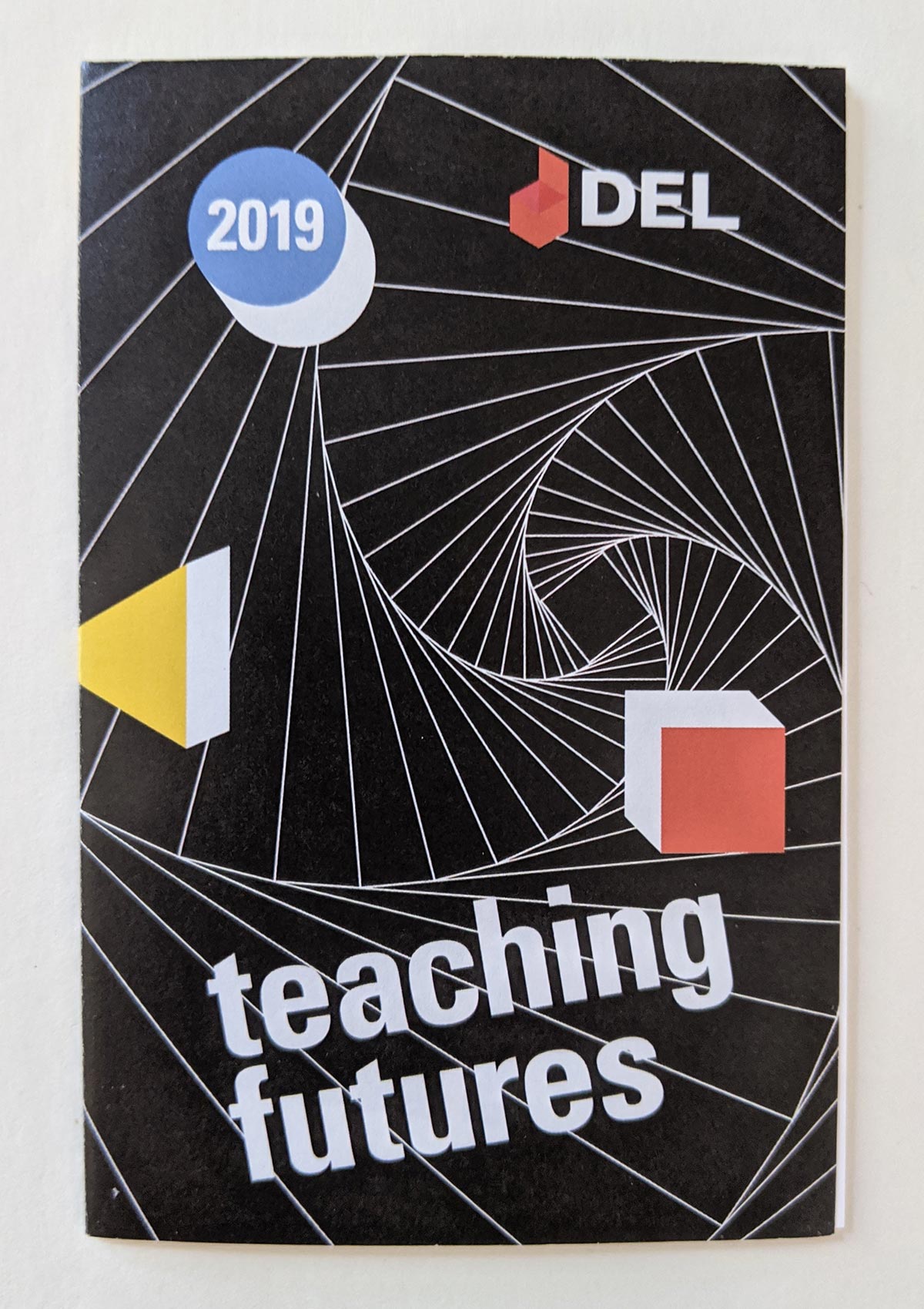
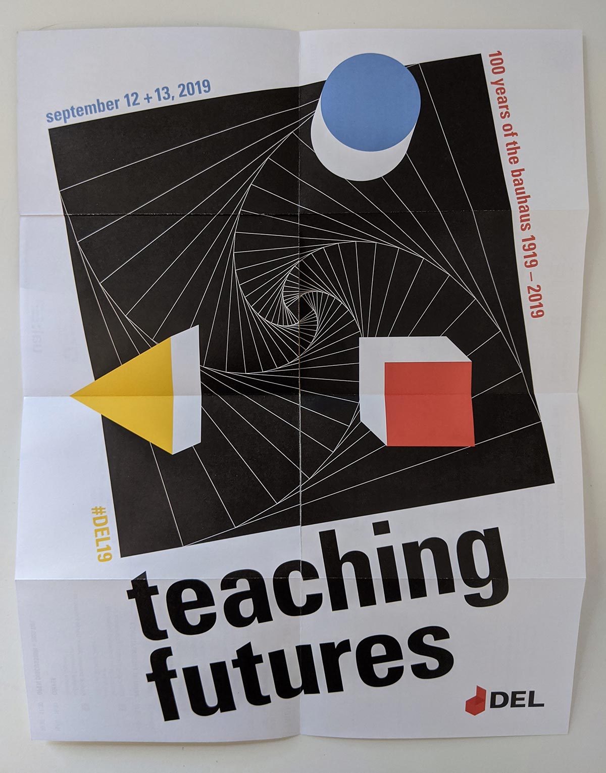
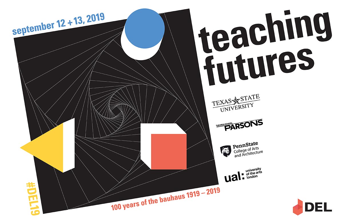
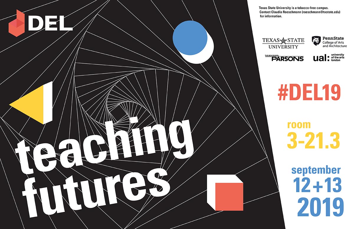
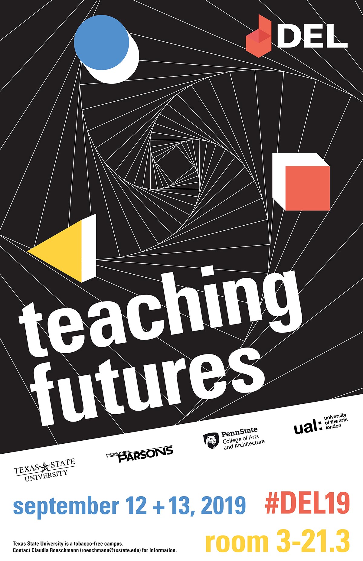
To achieve a unity between the concept of Bauhaus and Teaching Futures, I modified the existing branding to include a fractal pattern that acts as a portal between the future and past and complimented the square with a triangle and circle. These shapes are denoted in a traditional Bauhaus color scheme according to Kandinsky, where a triangle should be yellow (and sounds like a middle C on a trumpet), while circles are best adopted in blue. This concept works well with the existing collateral for DEL since it primarily uses a red square.
Badge System
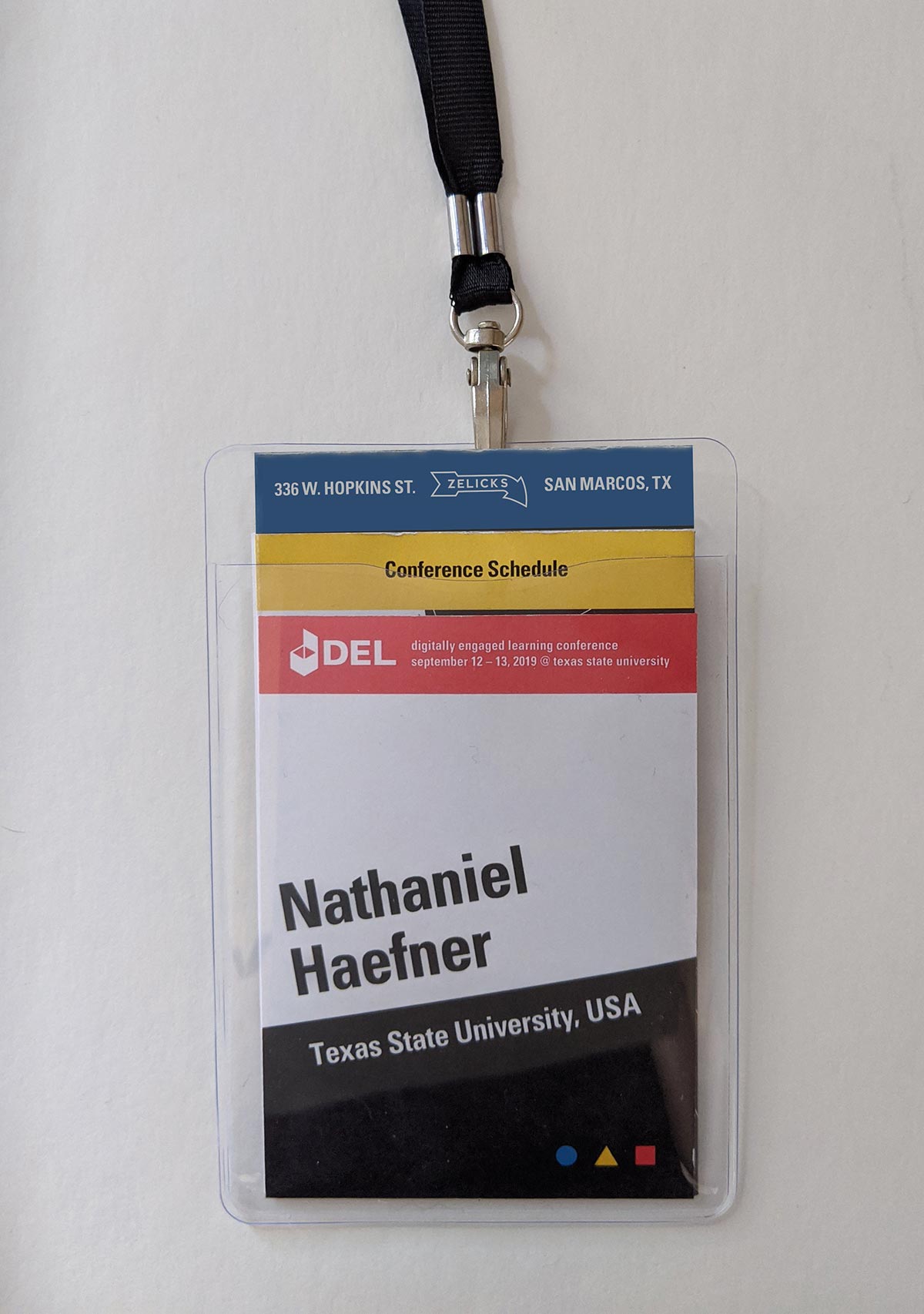
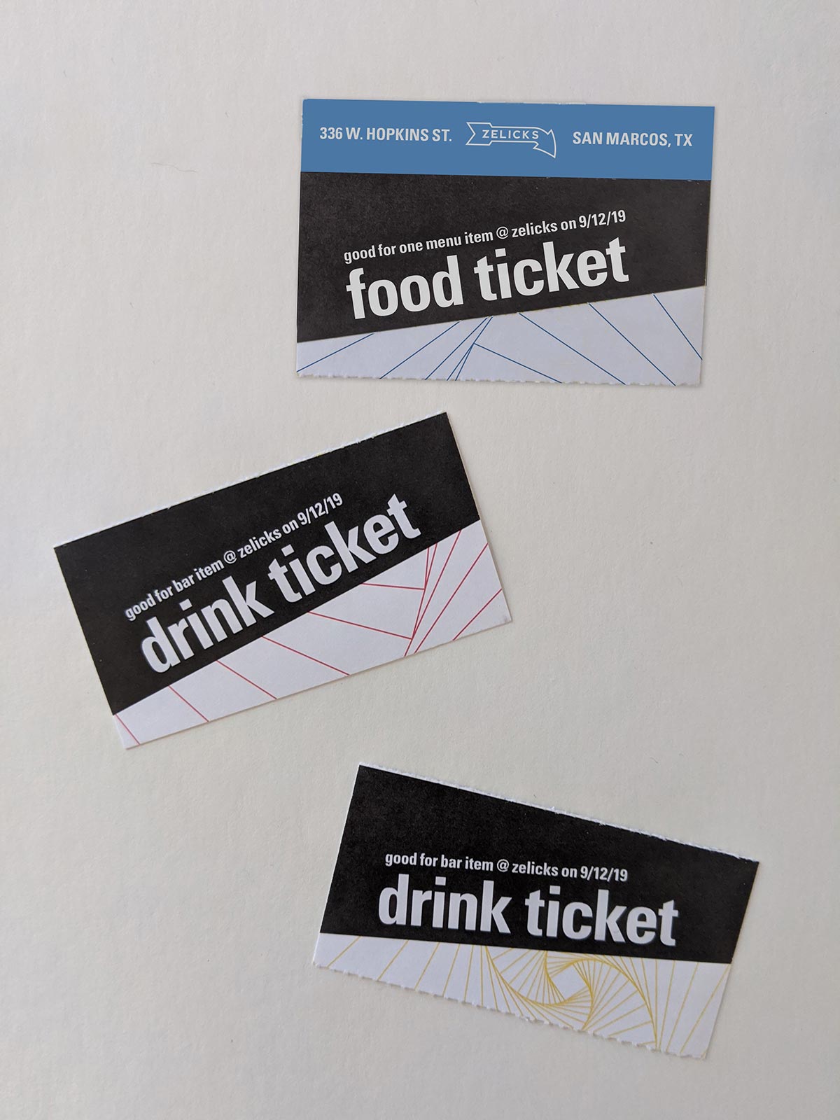
The main collateral follows a simplistic and minimalistic nature. Attendees get a single lanyard and id badge that hold their name tag, food and drink vouchers, and a small program/poster to guide them during the conference. The items all nest together in the badge, but have different heights to make it easy for attendees to pull out the item they need quickly. This tab system helps prevent the problem of items being stuck or hidden as well as making them print modularly.
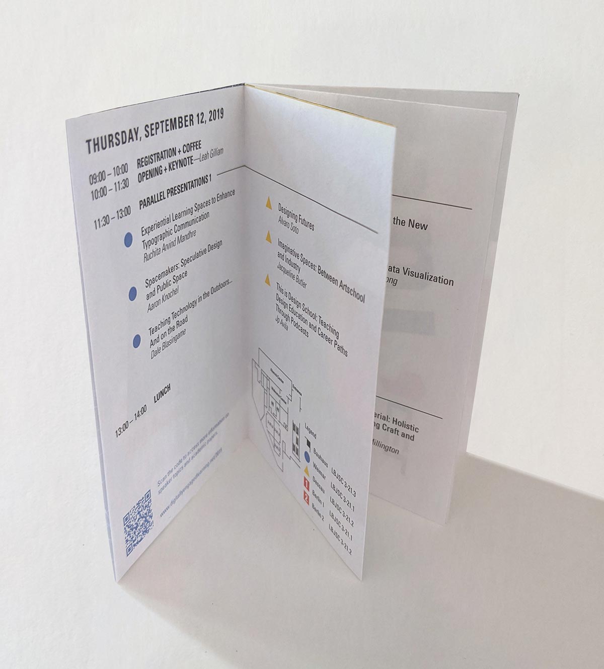
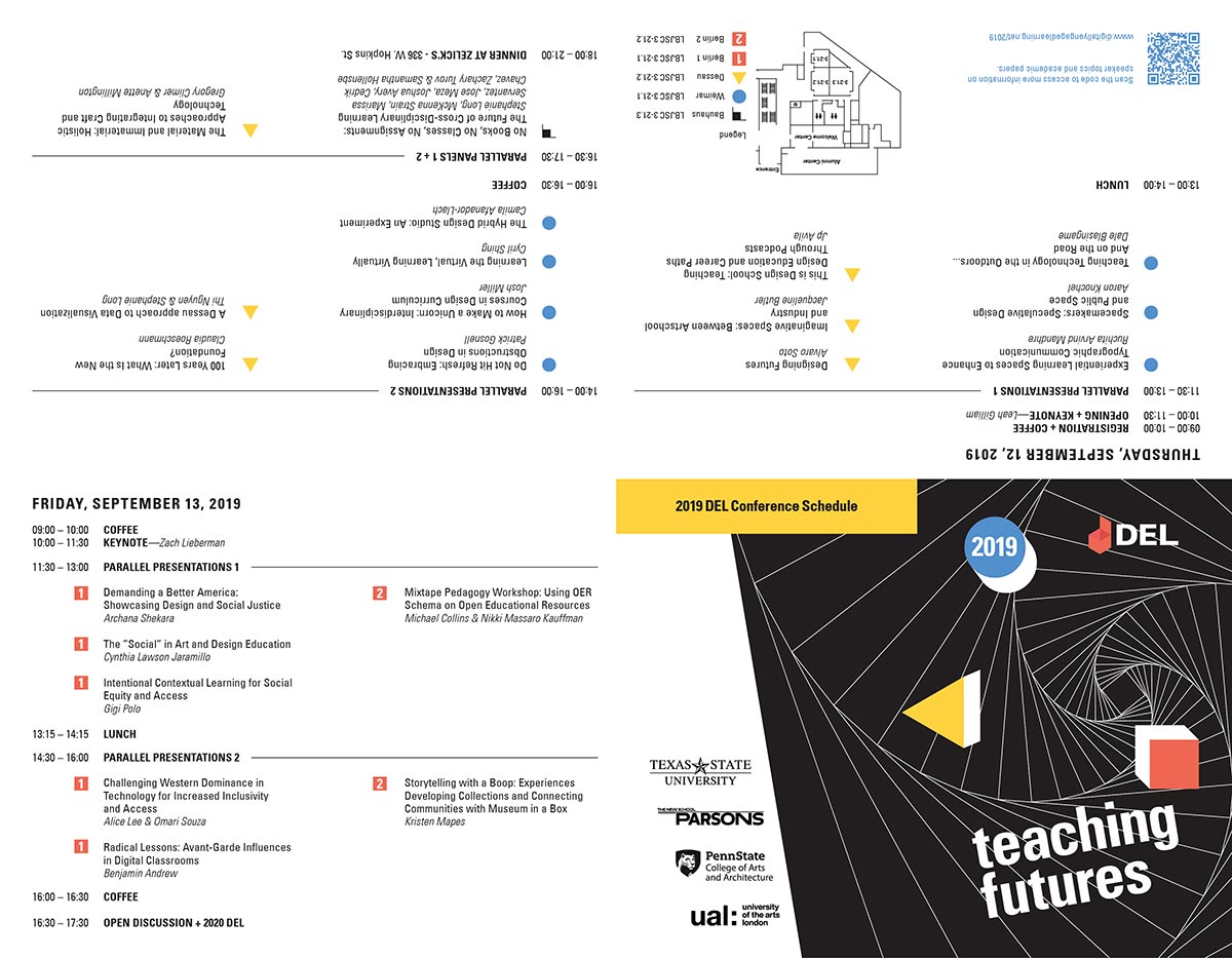
The middle layer of the badge is a folded program booklet with all the details of the events happening at the conference. The backside is a poster that serves as a souvenir for the attendees.
Signage
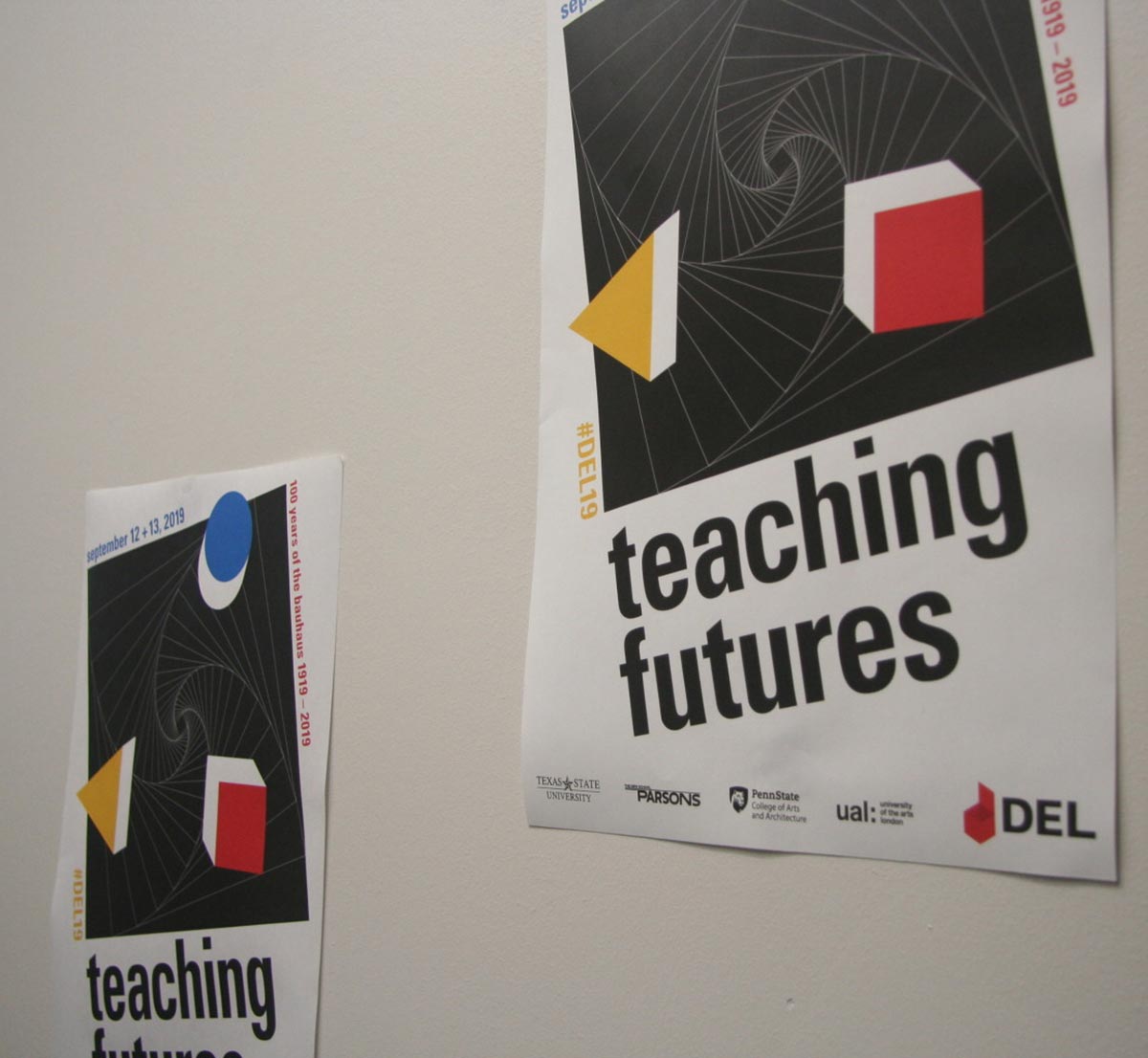
All additional collateral carries the theme of the conference branding. For the room signs and program schedule, yellow triangles, blue circles, and red squares inform attendees which event happens in which room and acts as a simple Bauhaus themed wayfind system. The signs are designed to save money, with each sign being double-sided and using less material.
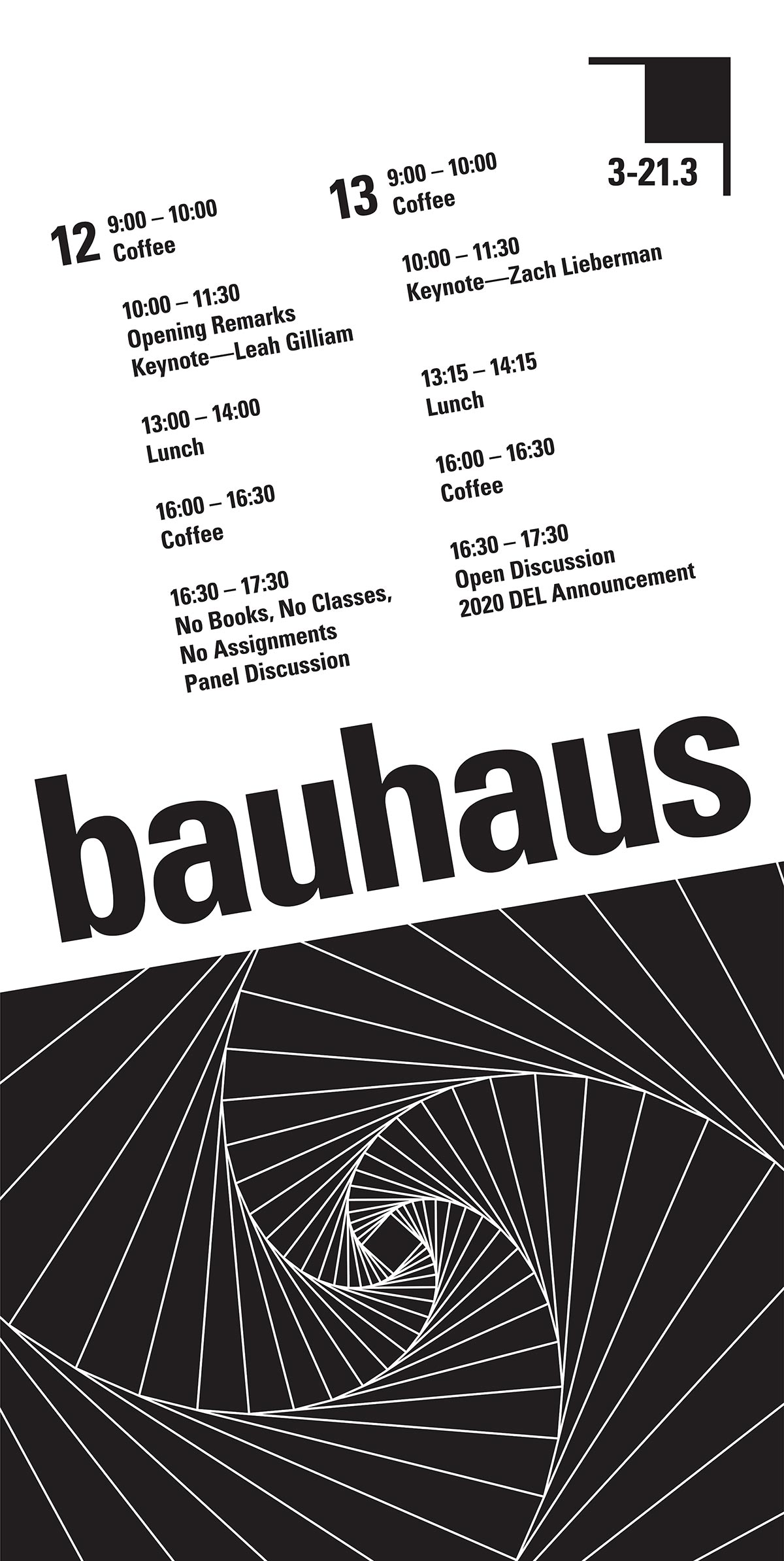
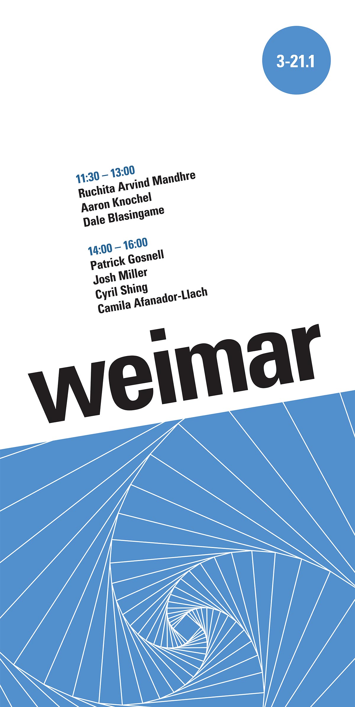
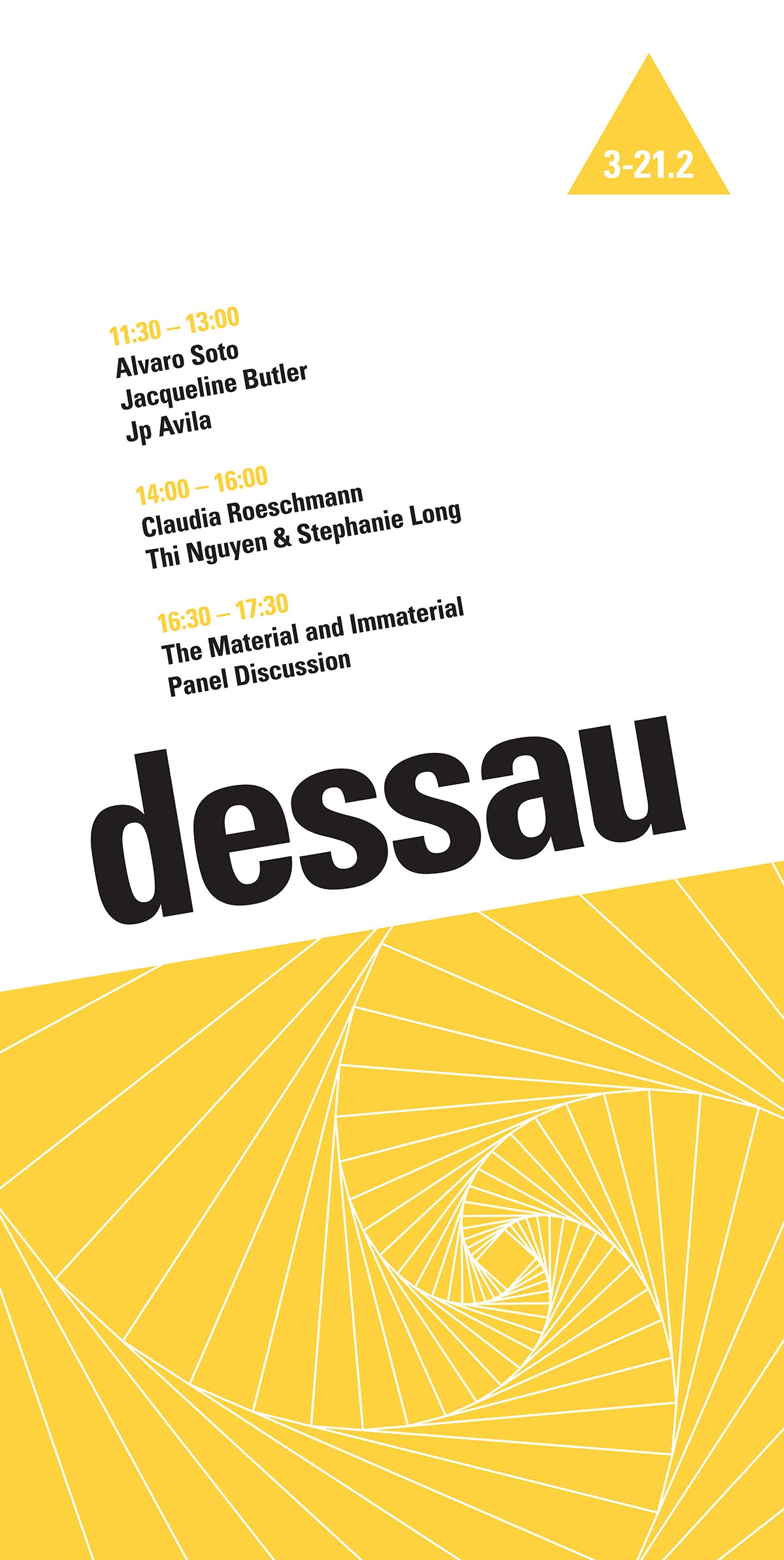
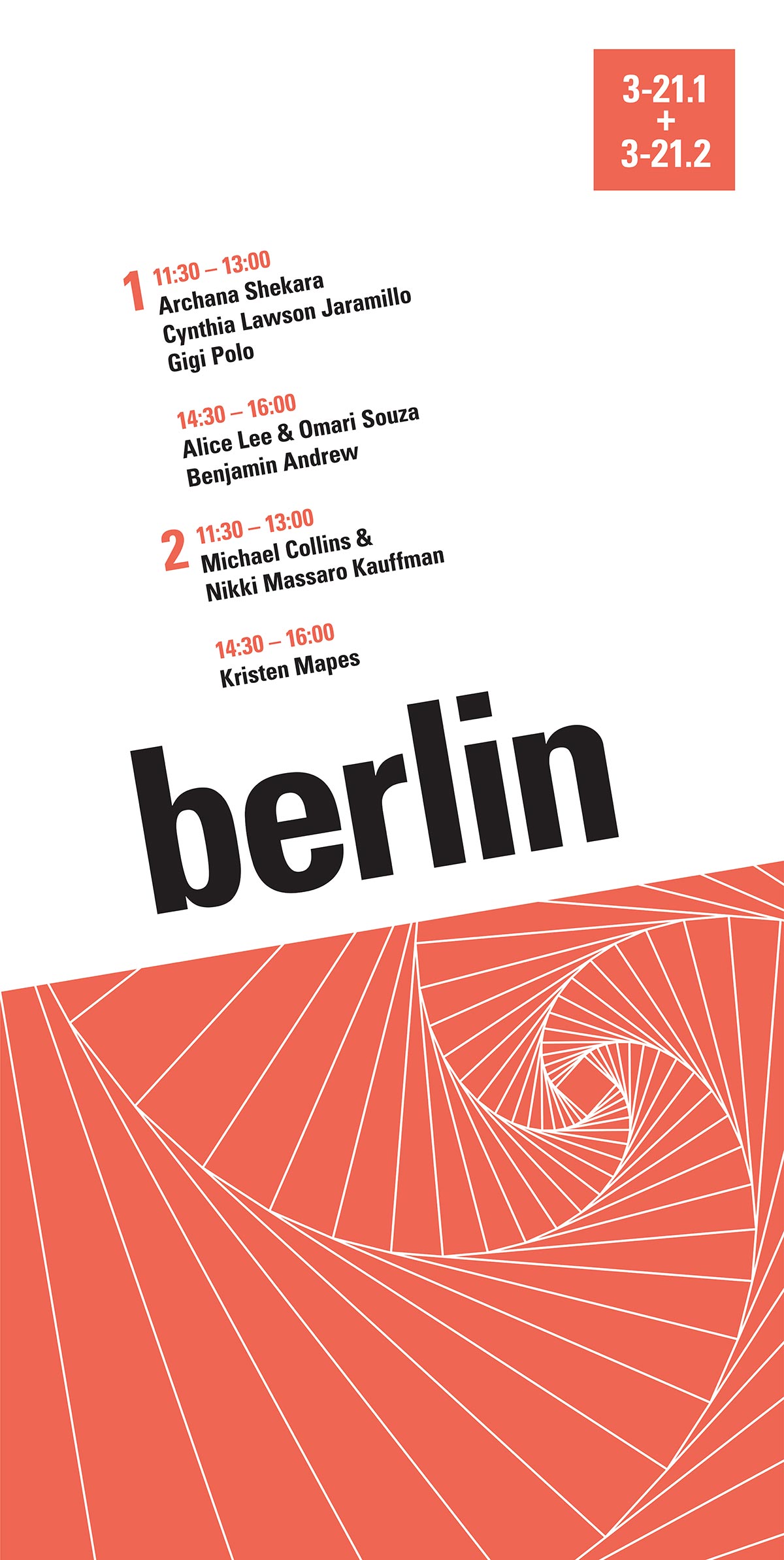
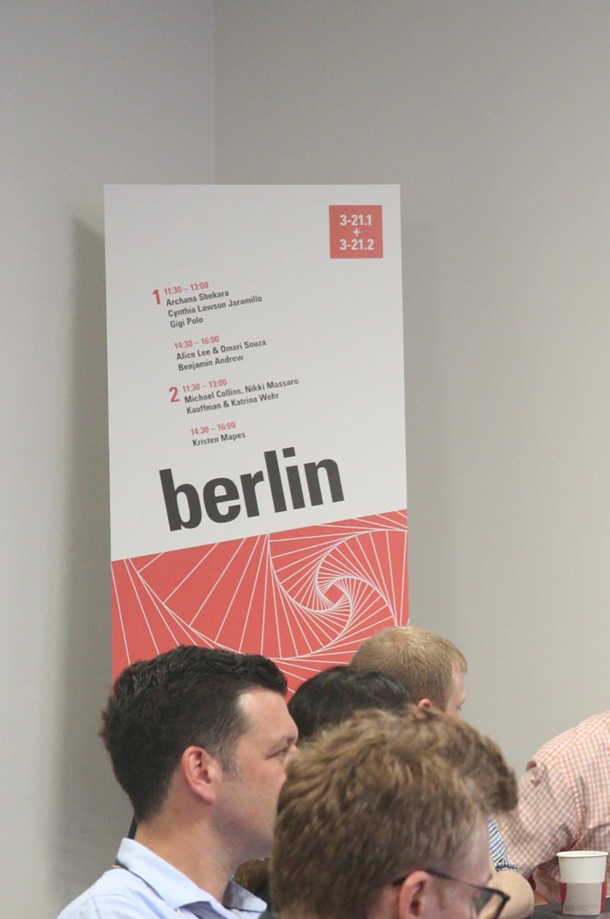
Signage outside the room and along the way to the conference helps people find the right room on campus.
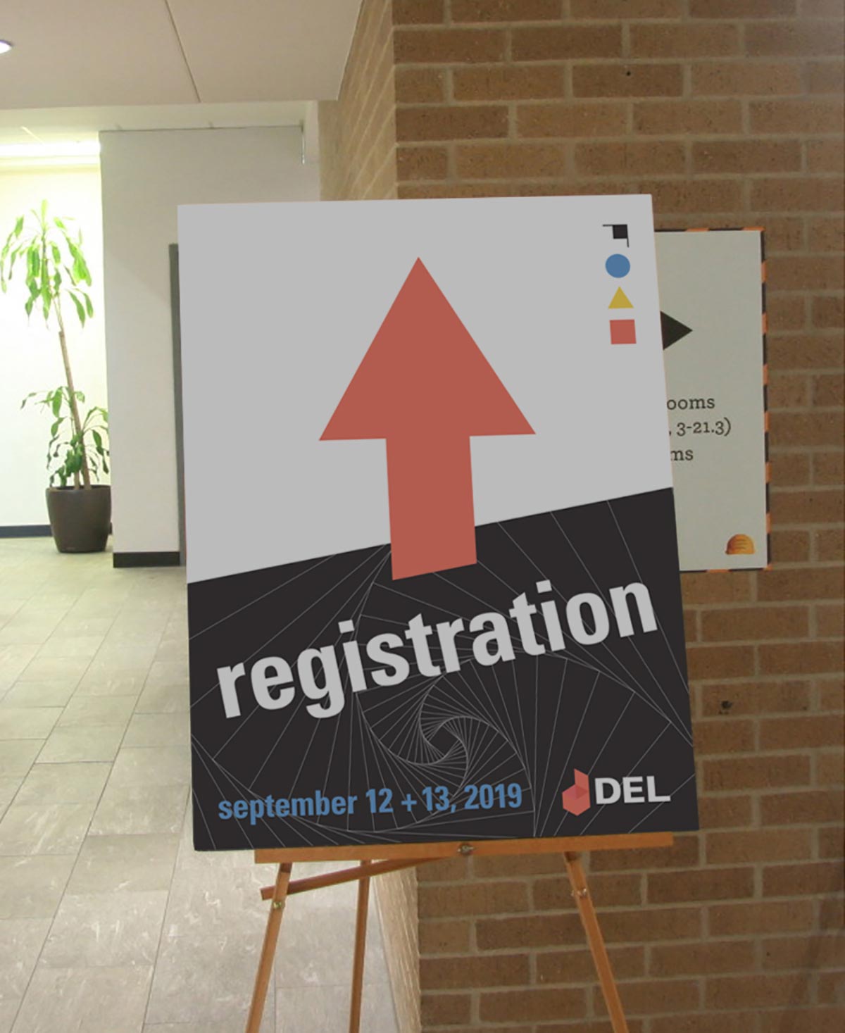
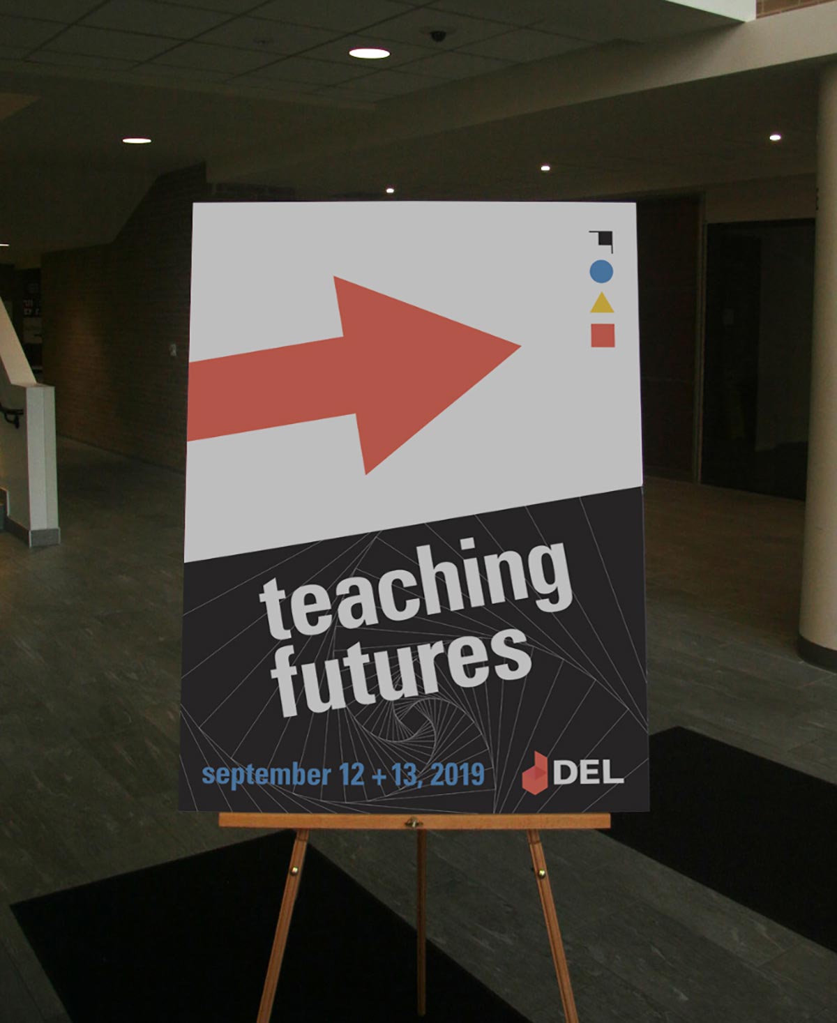
Digital Media
Texas State has many digital advertising screens around campus, so various formats needed to be designed to fit each screen. Since the conference ran most media on a projector during the conference, a simple screen needed to be designed to act as a placeholder between presentations.
Conference Swag
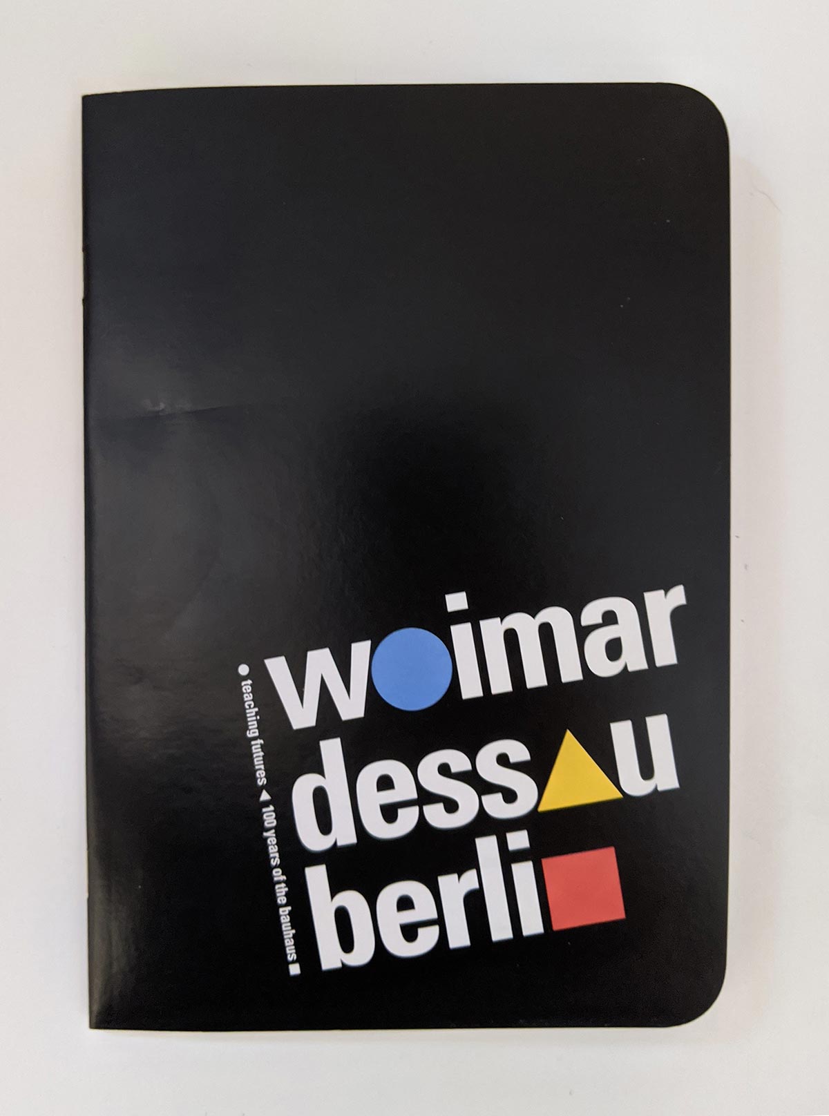
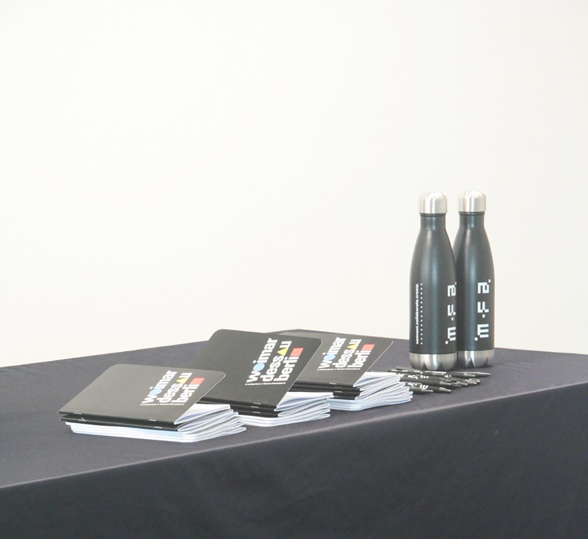
Attendees will also receive gridded notebooks with the dots replaced by the colored shapes in three separate notebooks, while the cover depicts conference details and the locations of the Bauhaus over time. A simple water bottle with a single color branding graphic serves as an extra souvenir while keeping one-use products to a minimum. The bottle became a generic design for the MFA program, so extras could be used for other events.



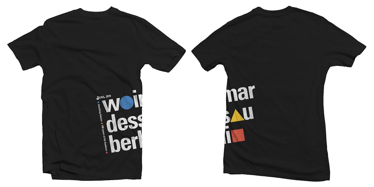
Special guests of the conference and student workers received a bauhaus themed t-shirt to wear while at the conference.
Another major factor in creating materials for a conference is budget. DEL has a very small budget, so it was important that many of the materials can be created in-house using school resources. Materials were designed to be printed cheaply, with mostly single colors and simple enough production methods for hand finishing by conference workers. Overall, the materials work well as a cohesive unit and should serve the conference well.
